A Comprehensive Setup Guide for Sitecore Search
As having recently investigated the setup of Sitecore Search and exploring the Sitecore Search Starter Kit, I wanted to share my learnings so you can avoid some of the struggles I had encountered. While information is being updated via the Search SDK GitHub page, I wanted to have a complete guide on how I approached the setup.
What You Need Before You Start
There are a few things you need to prepare before you’re ready to actually “run” the starter kit.
- A Sitecore Search Source setup and configured
- Resolve missing attributes
- Setup Sorting Options and Suggestion Blocks Feature Configuration
- Widget Configuration
- Source Setup, Published and Indexed
- A Local Sitecore Search Starter Kit cloned repository
- Updating Environment Variables
Sitecore Search Source Setup
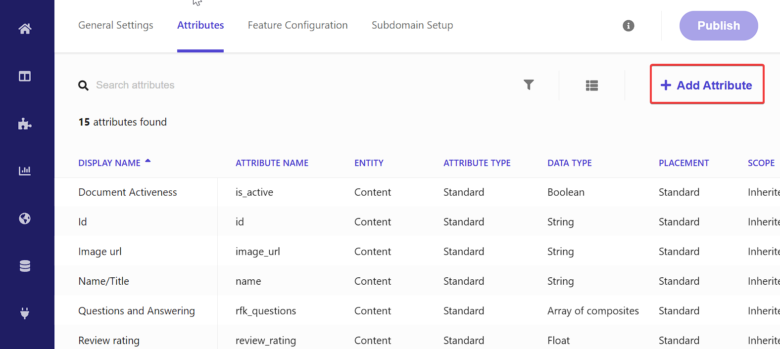
While setting up the source is important, I would say it’s not the first thing to tackle. Let’s head on down to Administration > Domain Settings > Attributes.
Setup Domain Attributes
Think of Domain Attributes as fields that can be applied and used by all sources within your domain.
Surprisingly not everything has been added by default, so something like title does not exist as an
attribute. So let’s add it.
Click on Add Attribute.
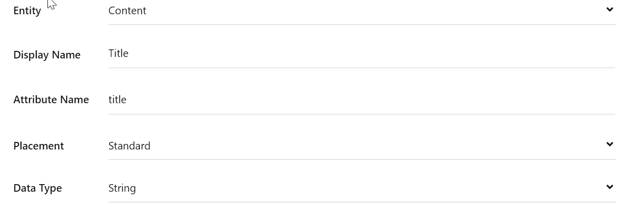
Add the appropriate details for title field.
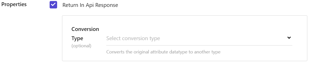
In the Properties section, don’t forget to select Return in Api Response so that it gets returned as
part of the query.
You will then want to create another field called keyphrase. I found that if I didn’t have a string type
field called keyphrase the starter kit would display an error in the console. At this time I’m not sure
on the exact need of it. However, without having the attribute loaded, you will receive errors. Should this change I
will update this article.
Setup Feature Configuration
We’re going to setup two specific areas.
- Sorting Options
- Suggestions Blocks
These configurations are required to be setup in order to utilize those particular options within the Search Starter Kit.
Sorting Options
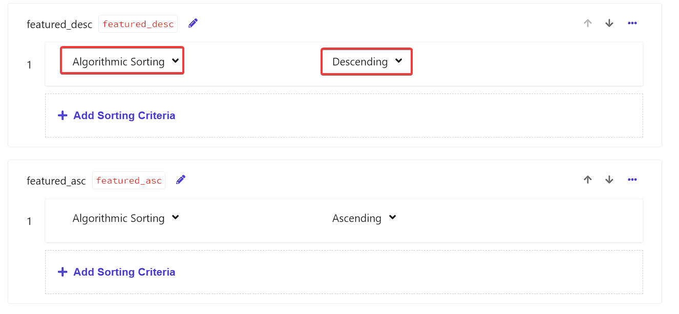
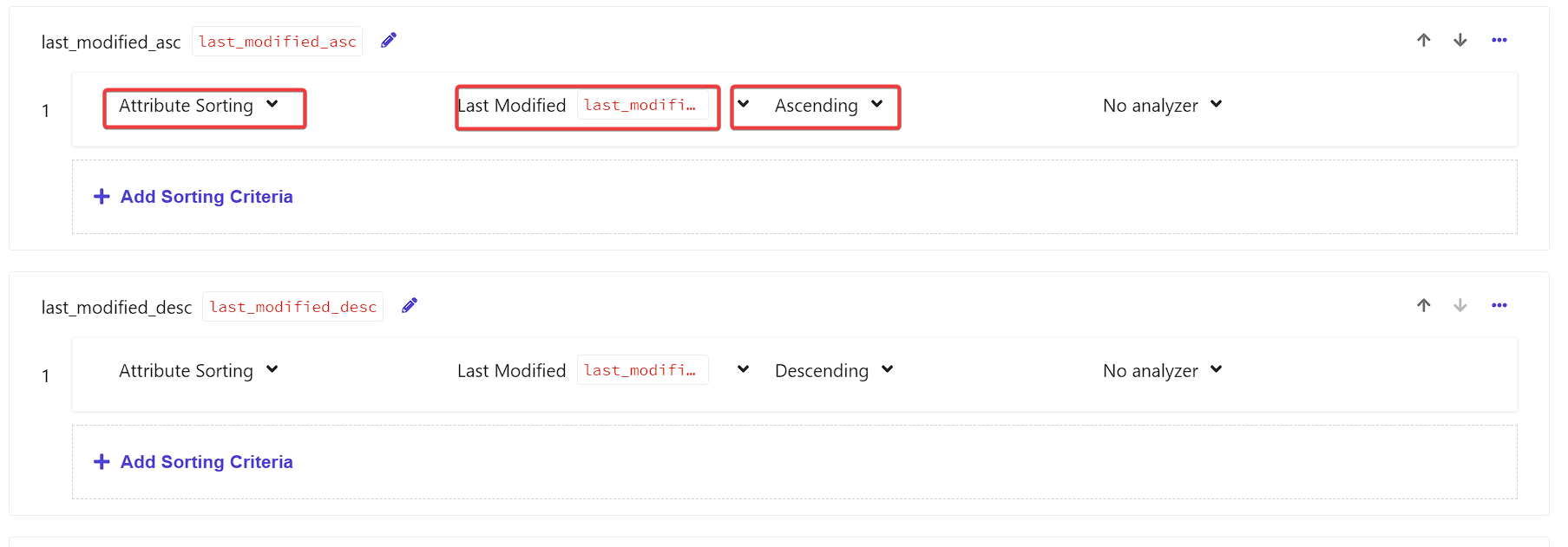
Let’s examine Sorting Options first. We’re going to create four attributes here.
featured_descfeatured_asclast_modified_desclast_modified_asc
Let’s add both featured options.
And now let’s add last_modified. Now, I just want to point out, unlike featured above,
last_modified is intended to be a sort on a field. As such, we choose Attribute Sorting and
then need to choose a field to sort on. By default there is no last_modified field to pick from. If we
were use a web crawler we would need to assign that field from some sort of metadata value. If we were using a sitemap
source, we could use the last_mod attribute.
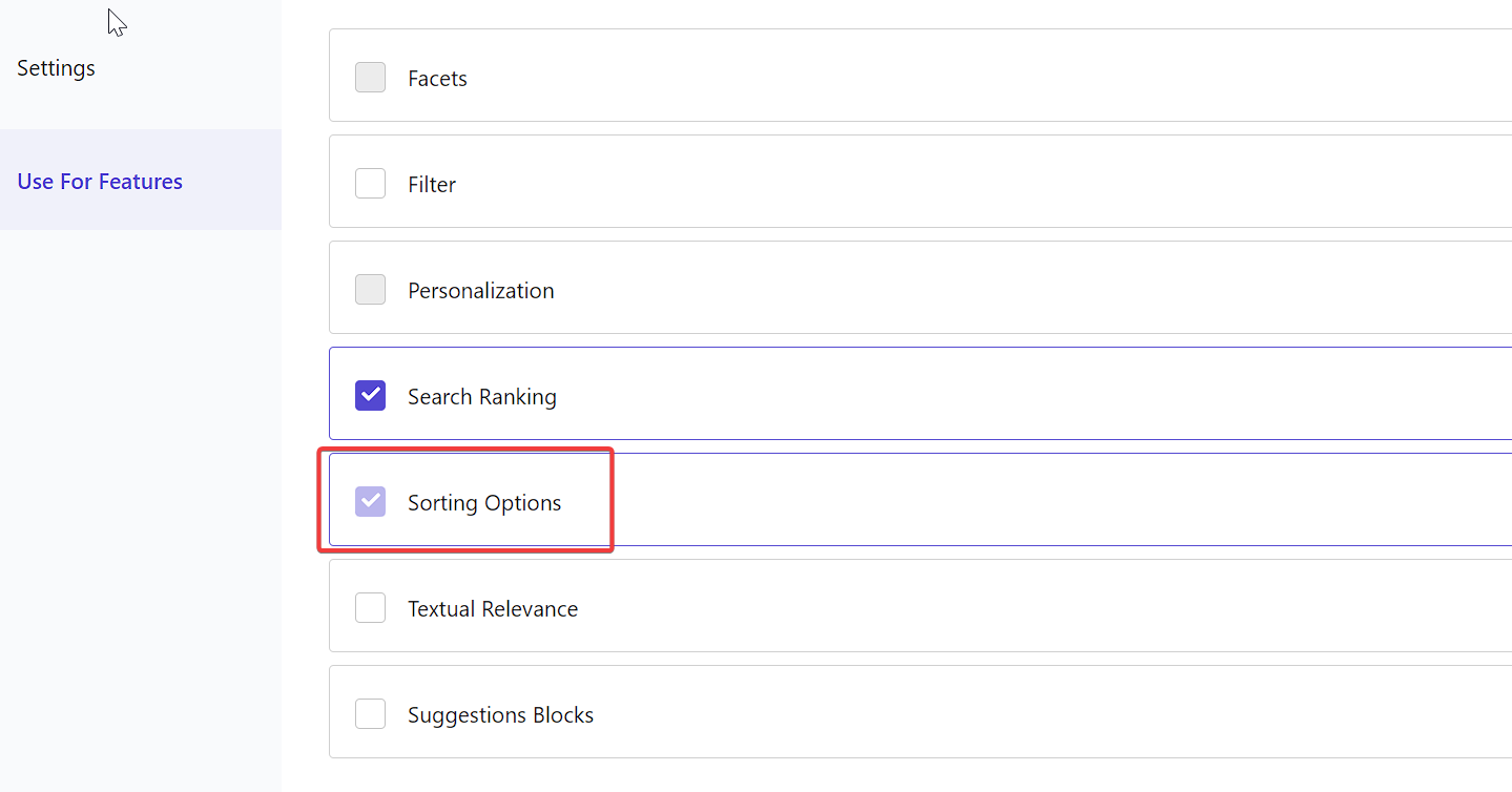
If you’re creating the last_modified attribute, be sure to go into Use for Features section.
You’ll see below, we had selected Sorting Options when we setup the last_modified field and because we’re
actively using it above, we can no longer de-select it below.
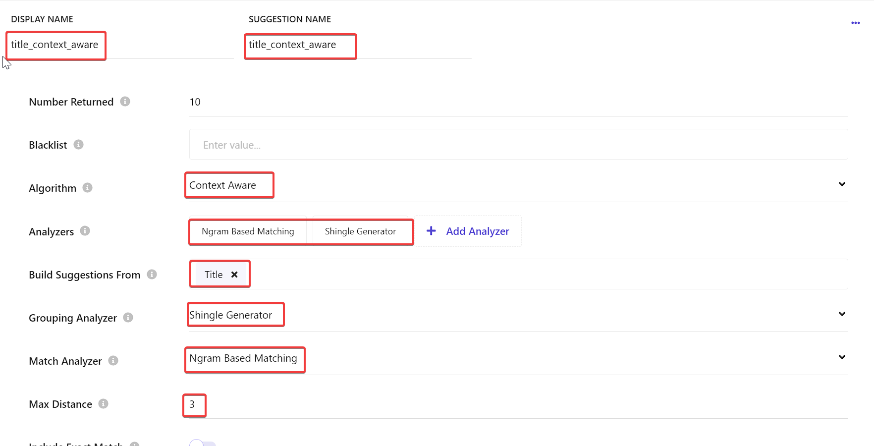
Setup Suggestions Blocks
Clicking Edit you will be taken inside Suggestions Blocks. First thing to do is to click
Add Attribute. You will want to select Title such that it can be used by the Suggestions
Blocks. Next, let’s add a Suggestion Option. We need an option called title_context_aware. We
need this field such that it can be used as part of the Preview Search Widget.
I’m sure, if you’re like me, you’re probably wondering “What is Ngram Based Matching? What are Shingle Generators?” Let’s break those down.
"N-gram based matching" and "shingle generator" are related concepts used in text analysis and information retrieval. However, they serve slightly different purposes and operate at different levels of granularity.
What is N-gram Based Matching?
N-grams, which can be words, letters, or other linguistic units, are consecutive sequences of n elements from a given text. N-gram matching analyses text sequences of individual tokens, such as words or letters, at the individual token level.
What is a Shingle Generator?
Contiguous token sequences made from text data are another aspect of shingling. On the other hand, shingling usually works at a higher abstraction level, emphasising groups of related phrases or tokens as opposed to single tokens. Shingles is able to identify specific word patterns in a text.
Setup Preview Search Widget
With this in place, you will want to Publish and reindex your items. After which, navigate to Widgets > Preview Search.
Click Add Rule and once there, use the left hand navigation to go to Settings.
First click on Suggestions Blocks. Once open, click Enable Configuration and then enable
title_context_aware.
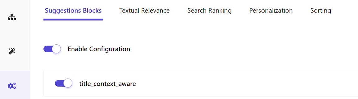
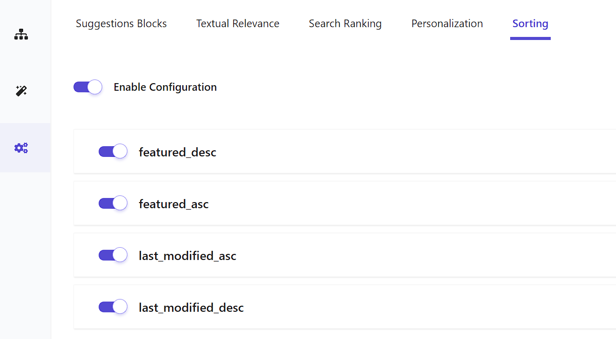
Then, click on Sorting Options. Once there, enable all four options.
Sitecore Search Source Setup
Now that we’ve setup all the Domain Attributes, Configuration and Widget setup, it’s time to setup an actual Sitecore Search Source.
From within the Sitecore Search Portal, let’s navigate to Sources. And then click Add Source.
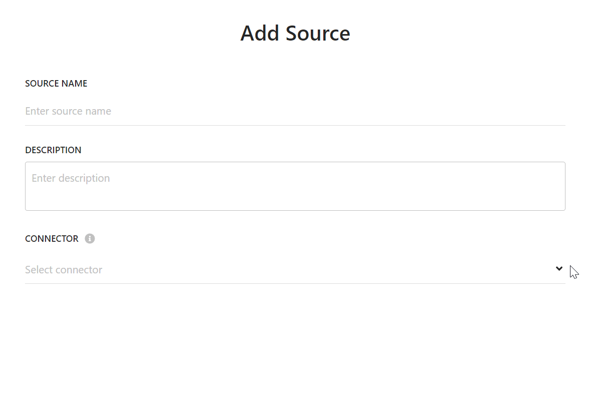
I recommend going with Web Crawler (Advanced) as you will get much more flexibility when it comes to
indexing the content of pages.
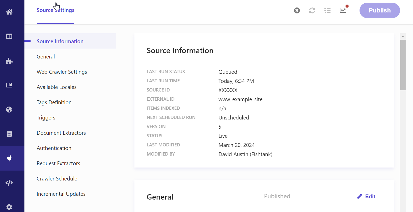
Now that we’ve setup a source, we have to configure it and you can see we have a fair number of ways to do so.
- Source Information
- General
- Web Crawler Settings
- Available Locales
- Tags Definition
- Triggers
- Document Extractors
- Authentication
- Request Extractors
- Crawler Schedule
- Incremental Updates
Everything except Source Information is editable. The most important sections and ones we’re going to look into today are Web Crawler Settings, Triggers, and Document Extractors. Not that the other areas aren’t important, but these areas are critical to getting a source of content indexed and available to be used.
Web Crawler Settings
Here we are able to setup what domains are allowed to be in our source, the depth of the query, the number of URLs to
crawl. You can also setup the user agent to crawl as via the Headers section. For Next.js apps, we’re
going to want to switch on Enable Navigation Cookies During Crawling and Render Javascript.
Triggers
This area let’s us determine how we want to kick off an indexing. We can do a simple Request where we hit a single URL and then effectively crawl from there. Or we can setup a Sitemap trigger where we look for changes in the sitemap.xml file and then index from there.
Document Extractors
This is how we assign and relate content from a page into fields of an item in the index. You can setup yours like so.
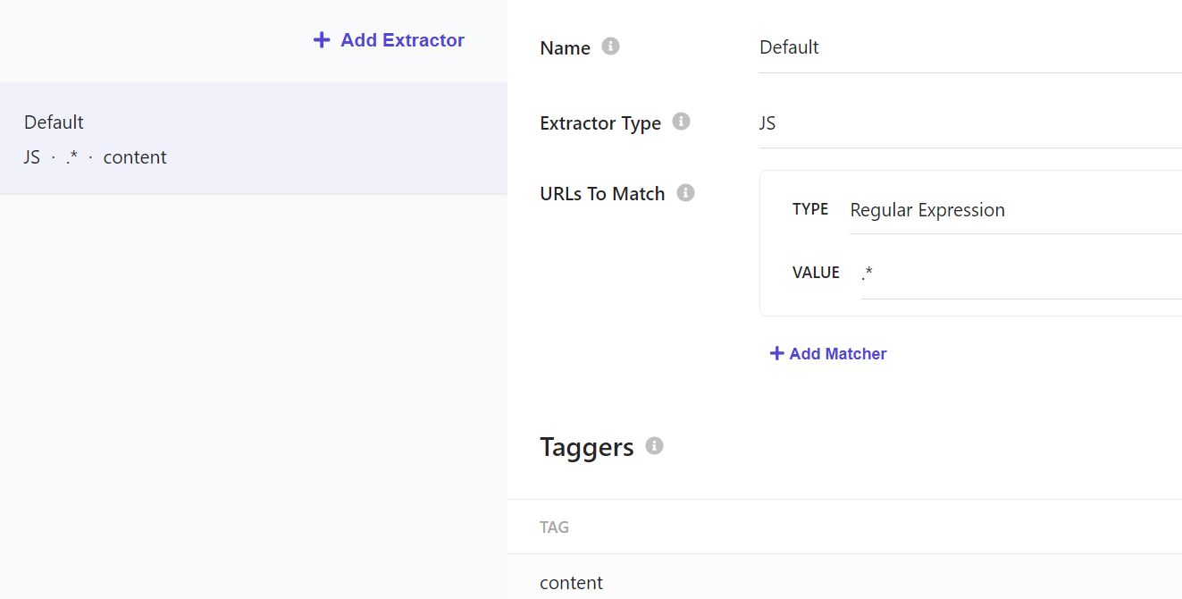
And then under Taggers we are able to actually apply the field values utilizing JavaScript selectors. Here’s an example of what it would look like:
// Sample extractor function. Change the function to suit your individual needs
function extract(request, response) {
    $ = response.body;
    url = request.url;
    id = url.replace(/[/:.]/g, '_');

    return [{
        'id': id,
        'description': $('meta[name="description"]').attr('content') || $('meta[property="og:description"]').attr('content') || $('p').text(),
        'name': $('meta[name="searchtitle"]').attr('content') || $('title').text(),
        'title': $('title').text(),
        'type': $('meta[property="og:type"]').attr('content') || 'website_content',
        'url': $('meta[property="og:url"]').attr('content'),
        'body': $('body').text()
    }];
}
Once you’ve completed the configuration you can then publish and force an indexing. If you encounter errors, I recommend having a look at our article on Where To Debug Errors In Your Sitecore Search Index.
Sitecore Search Starter Kit
Environment Variable Setup
If you’re pulling a fresh Sitecore Search Starter Kit, then you’ll likely need to create the .env file in the root of your project,
otherwise, you’ll want to add these four variables to your existing one.
VITE_SEARCH_ENV=<environment - Expected values: prod, staging, prodEu or apse2 >
VITE_SEARCH_CUSTOMER_KEY=<customer key>
VITE_SEARCH_API_KEY=<API key provided in CEC>
VITE_SEARCH_PATH=<Path for the site>. This variable is optional, use it only if the site domain also includes an extra path.
I want to break down where all of these values come from.
VITE_SEARCH_ENV- While it looks like you enter in whatever value you feel your environment is for, that’s not the case. It’s has to be one of the four listed.VITE_SEARCH_CUSTOMER_KEY- This value comes from Developer Resources > API Access (tab) in the Customer Key section.VITE_SEARCH_API_KEY- This value comes from Developer Resources > API Access (tab) in the API Keys section.VITE_SEARCH_PATH- This value is optional, it largely depends where your search page is located.
Running Sitecore Search Example
After cloning the repository and updating the environment variables, you can run it locally by first, installing all required Node modules.
npm i
And then by running the development environment.
npm run dev
After doing so you’ll be presented with the following:
  VITE v4.4.6  ready in 4470 ms

  ➜  Local:   http://localhost:5173/
  ➜  Network: use --host to expose
  ➜  press h to show help
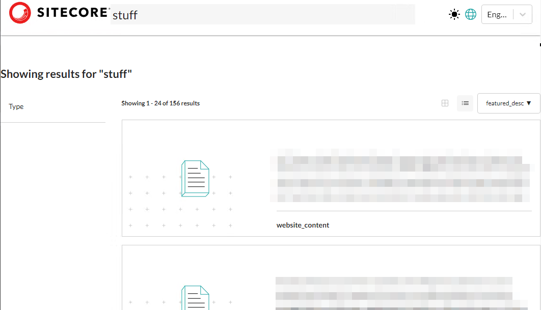
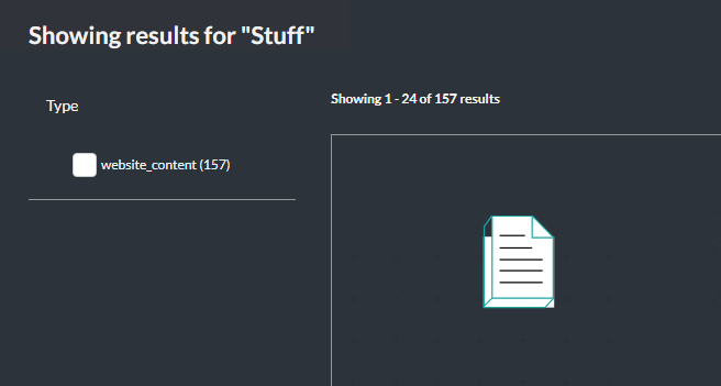
Clicking the URL you’ll be presented with the page below.
Typing in the search field, and submitting will take you the search page. Here we entered in “stuff” and got back a list of pages.
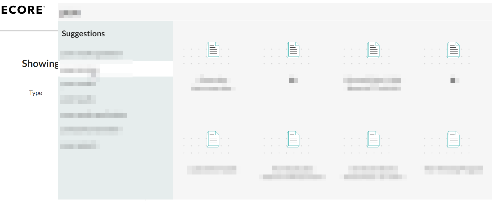
If you type in the search box, out-of-the-box, the Preview Search widget shows you a list of search queries that will yield results. It’s a really a remarkable powerful feature.
Let’s take a look at the components that make the above possible. The first to realize is that Sitecore Search refers to them as Widgets.
I should point out that while there appears to be a lot going on, while investigating the starter kit, a lot of the
structure is just styled <div> tags. That said, there is a method to the madness as by building the
widget this way, they are able to identify each aspect that makes up the widget and refer to them by name and greatly
improves readability allowing for you to understand the purpose that they serve.
Preview Search Widget
The Preview Search widget exists in two places, on the home page of the starter kit it exists in that top navigation. And then on the search page itself, it’s where you find the search input field.
In fact, the Preview Search widget contains the search input field as part of the structure thus incorporating that Widget will always ensure that your preview results display. Let’s break down the widget and identify the important areas.
The code itself is located under: src/widgets/PreviewSearch/index.js
import { useCallback } from 'react';
import { useNavigate } from 'react-router-dom';

import { WidgetDataType, usePreviewSearch, widget } from '@sitecore-search/react';
import { Presence, PreviewSearch } from '@sitecore-search/ui';

import { DEFAULT_IMAGE, HIGHLIGHT_DATA } from '../../data/constants';
import { HighlightComponent, getDescription } from '../utils';
import {
  ArticleCardStyled,
  LoaderAnimation,
  LoaderContainer,
  PreviewSearchStyled,
  SearchGroupHeadingStyled,
} from './styled';
Within the import statements you can see several references to @sitecore-search/ui and
@sitecore-search/react. These are ones that should be understood as for example, not understanding the
purpose and use of usePreviewSearch you wouldn’t be able to customize the query and results of the widget
itself. What is usePreviewSearch? Well, it’s what you’d call a Query Hook. These are components
that communicate with the Sitecore Search API.
In brief, each Query Hook, and there are others as I will get into, are broken down into five attributes:
querywidgetRefactionsstatequeryResult
Other Query Hooks include:
useRecommendationuseSearchResultuseContentBlock
Then we have the PreviewSearchNewComponent which will perform and handle the query input and submission.
export const PreviewSearchNewComponent = ({ defaultItemsPerPage = 8 }) => {
...
};
const PreviewSearchNewWidget = widget(PreviewSearchNewComponent, WidgetDataType.PREVIEW_SEARCH, 'content');
export default PreviewSearchNewWidget;
The search input form is a relatively simple form:
<form onSubmit={handleSubmit}>
  <PreviewSearchStyled.Input
    onChange={keyphraseHandler}
    autoComplete="off"
    placeholder="Type to search..."
    name="query"
  />
</form>
There are certainly ways you can customize it. The placeholder value could / should come from a Sitecore
datasource as well as the ability to turn off or on the autoComplete.
Whenever the input field is updated, the keyphraseHandler is run.
 const keyphraseHandler = useCallback(
    (event) => {
      const target = event.target;
      onKeyphraseChange({ keyphrase: target.value });
    },
    [onKeyphraseChange],
  );
And each time it’s run, the onKeyphraseChange action is run with the keyphrase value set.
The onKeyphraseChange action comes from
const {
    widgetRef,
    actions: { onItemClick, onKeyphraseChange },
    queryResult,
    queryResult: {
      isFetching,
      isLoading,
      data: { suggestion: { title_context_aware: articleSuggestions = [] } = {} } = {},
    },
  } = usePreviewSearch({
    query: (query) => {
      query
        .getRequest()
        .setSearchQueryHighlightFragmentSize(500)
        .setSearchQueryHighlightFields(['title', 'description'])
        .setSearchQueryHighlightPreTag(HIGHLIGHT_DATA.pre)
        .setSearchQueryHighlightPostTag(HIGHLIGHT_DATA.post);
    },
    state: {
      suggestionsList: [{ suggestion: 'title_context_aware', max: 10 }],
      itemsPerPage: defaultItemsPerPage,
    },
  });
The code above is what handles the two primary aspects of performing a search:
- updating search query
- fetching the new results
As you can see in the suggestionsList this is where title_context_aware comes into play.
And if we look at setSearchQueryHighlightFields we know what will be getting displayed and how the
highlighting will be applied. Thus, how we can customize it so we choose.
Under queryResult we can see the attributes at our disposal in terms of when and what content is being
displayed.
Search Results Widget
The Search Results Widget is as you’d expect, the widget that displays everything from facets and sorting options to query summary and the results themselves.
The code itself is located under: src/widgets/SearchResults/index.js
The import statements are considerable larger, for obvious reasons:
import { useContext, useState } from 'react';
import { useNavigate } from 'react-router-dom';

import { ArrowLeftIcon, ArrowRightIcon, CheckIcon, GridIcon, ListBulletIcon } from '@radix-ui/react-icons';
import { Presence } from '@radix-ui/react-presence';
import {
  WidgetDataType,
  useSearchResults,
  widget,
  useSearchResultsSelectedFilters,
} from '@sitecore-search/react';
import { AccordionFacets, CardViewSwitcher, Pagination, Select, SortSelect } from '@sitecore-search/ui';

import { LanguageContext } from '../../contexts/languageContext';
import { DEFAULT_IMAGE, HIGHLIGHT_DATA } from '../../data/constants';
import { HighlightComponent, getDescription } from '../utils';
import {
  AccordionFacetsStyled,
  ArticleCardRowStyled,
  ArticleCardStyled,
  CardViewSwitcherStyled,
  FiltersStyled,
  GridStyled,
  LoaderAnimation,
  LoaderContainer,
  PageControlsStyled,
  PaginationStyled,
  QuerySummaryStyled,
  RowStyled,
  SearchResultsLayout,
  SelectStyled,
  SortSelectStyled,
} from './styled';
import PropTypes from 'prop-types';
Like Preview Search before, there are two sets of functions and components that should be understood in
order to customize. For example: useSearchResults acts as the query hook. Unlike Preview Search
however, there are a lot more ways that an updated query can be triggered. Thankfully they are all self explanatory.
onResultsPerPageChangeonPageNumberChangeonItemClickonRemoveFilteronSortChangeonFacetClick
When a query is initiated, the isFetching state is updated and the loading animation is displayed until
isFetching returns false. It is essentially the gate keeper until all information that supports things
like the query summary, associated facet listings, and complete list of all articles (i.e. search results).
The query summary, giving an indication of how much is showing, is relatively straight-forward.
{totalItems && (
  <QuerySummaryStyled>
    <b>
      Showing {itemsPerPage * (page - 1) + 1} - {itemsPerPage * (page - 1) + articles.length} of{' '}
      {totalItems} results
    </b>
  </QuerySummaryStyled>
)}
Facets
Facets themselves are a unique beast. They’re broken down into two sections. The first being the facets that have been selected by the user.
{selectedFacetsFromApi.map((selectedFacet) => (
  <FiltersStyled.SelectedFiltersListItem
    key={`${selectedFacet.facetId}${selectedFacet.facetLabel}${selectedFacet.valueLabel}`}
  >
    <FiltersStyled.SelectedFiltersListItemText>
      {selectedFacet.facetLabel}: {selectedFacet.valueLabel}
    </FiltersStyled.SelectedFiltersListItemText>
    <FiltersStyled.SelectedFiltersListItemButton onClick={() => onRemoveFilter(selectedFacet)}>
      X
    </FiltersStyled.SelectedFiltersListItemButton>
  </FiltersStyled.SelectedFiltersListItem>
))}
The second being he list of all available facets for the content provided. If the content that is returned does not
have facets setup, then nothing will show here. If you want to have specific attributes be set as facets then you
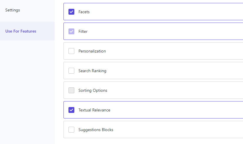
would need to set that up in the Sitecore Search Portal and then for an attribute, if we say, look at the OOTB
tags attribute, you can see it has Facets, Filters and Textual Relevance selected.
The code performs two maps allowing you to have multiple facet attributes.
<AccordionFacetsStyled.Root
  defaultFacetTypesExpandedList={[]}
  onFacetTypesExpandedListChange={() => {}}
  onFacetValueClick={onFacetClick}
>
  {facets.map((f) => (
    <AccordionFacetsStyled.Facet facetId={f.name} key={f.name}>
      <AccordionFacetsStyled.Header>
        <AccordionFacetsStyled.Trigger>{f.label}</AccordionFacetsStyled.Trigger>
      </AccordionFacetsStyled.Header>
      <AccordionFacets.Content>
        <AccordionFacetsStyled.ValueList>
          {f.value.map((v, index) => (
            <AccordionFacetsStyled.Item {...{ index, facetValueId: v.id }} key={v.id}>
              <AccordionFacetsStyled.ItemCheckbox>
                <AccordionFacetsStyled.ItemCheckboxIndicator>
                  <CheckIcon />
                </AccordionFacetsStyled.ItemCheckboxIndicator>
              </AccordionFacetsStyled.ItemCheckbox>
              <AccordionFacetsStyled.ItemCheckboxLabel>
                {v.text} {v.count && `(${v.count})`}
              </AccordionFacetsStyled.ItemCheckboxLabel>
            </AccordionFacetsStyled.Item>
          ))}
        </AccordionFacetsStyled.ValueList>
      </AccordionFacets.Content>
    </AccordionFacetsStyled.Facet>
  ))}
</AccordionFacetsStyled.Root>
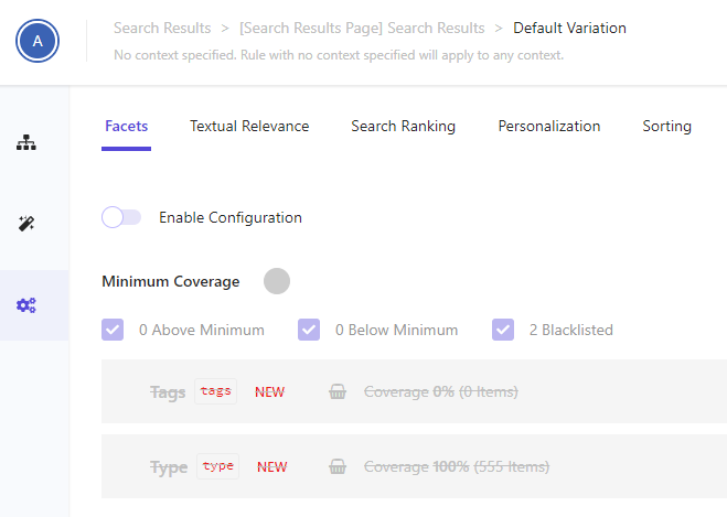
Unless you’ve setup on the Search Results Widget > Settings > Facets switched on
Enable Configuration you will not see any facets to begin with as by default it is switched off. Likewise
for Sorting, however with Sorting, if you have nothing enabled here, it will use whatever you have
within Preview Search Widget as a fallback.
Once clicking Enable Configuration you’ll then have to enable the Facet you want to use. It’s not
immediately obvious how to do this but you’ll want to select the + symbol on each facet type. You can get
a clear idea what potential options have for results as to whether they would present values. You can see this in the
Coverage attribute of each as it gives you a percentage of items it covers, which is extremely handy.
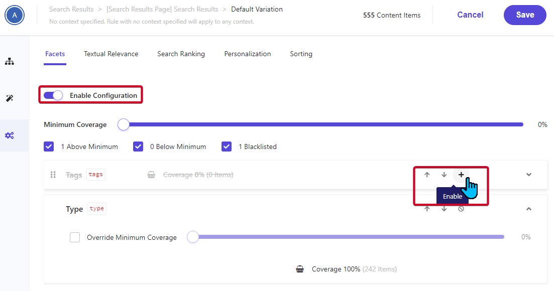
Enabling type, we now see the facet values applied.
Search Results Listing
The Starter Kit itself offers two ways you can see the results, but chances are, when it comes to branding your own,
you may choose one way or the other. At least in our experience. The toggle of the CardViewSwitcher is
what controls which gets displayed:
 {/* Card View Switcher */}
<CardViewSwitcherStyled.Root onValueChange={onToggle} defaultValue={defaultCardView}>
  <CardViewSwitcherStyled.Item value="grid" aria-label="Grid View">
    <GridIcon />
  </CardViewSwitcherStyled.Item>
  <CardViewSwitcherStyled.Item value="list" aria-label="List View">
    <ListBulletIcon />
  </CardViewSwitcherStyled.Item>
</CardViewSwitcherStyled.Root>
Regardless of the choice, both require looping through the results, aka articles array.
{articles.map((a, index) => (
  <ArticleCardRowStyled.Root key={`${a.id}@${a.source_id}@${language}`}>
    <ArticleCardRowStyled.Left>
      <ArticleCardRowStyled.Image src={a.image_url || a.image || DEFAULT_IMAGE} />
    </ArticleCardRowStyled.Left>
    <ArticleCardRowStyled.Right>
      <ArticleCardRowStyled.Title>
        <ArticleCardRowStyled.Link
          to={`/detail/${a.id}`}
          onClick={(e) => {
            e.preventDefault();
            onItemClick({ id: a.id || '', index });
            navigate(`/detail/${a.id}`);
          }}
        >
          {a.title}
        </ArticleCardRowStyled.Link>
      </ArticleCardRowStyled.Title>
      <ArticleCardRowStyled.Content>
        <HighlightComponent
          text={getDescription(a, 'description')}
          preSeparator={HIGHLIGHT_DATA.pre}
          postSeparator={HIGHLIGHT_DATA.post}
          highlightElement={HIGHLIGHT_DATA.highlightTag}
        />
      </ArticleCardRowStyled.Content>
      <ArticleCardRowStyled.Type>{a.type ? a.type : 'Unknown'}</ArticleCardRowStyled.Type>
    </ArticleCardRowStyled.Right>
  </ArticleCardRowStyled.Root>
))}
Following through the code it is fairly straight-forward on where we can apply customizations to design and / or functionality should we require it.
In Summary
I hope to cover a complete guide on setting up a custom widget and how you can incorporate it into your front end application here in the near future.

Meet David Austin
Development Team Lead | Sitecore Technology MVP x 3
📷🕹️👪
David is a decorated Development Team Lead with Sitecore Technology MVP and Coveo MVP awards, as well as Sitecore CDP & Personalize Certified. He's worked in IT for 25 years; everything ranging from Developer to Business Analyst to Group Lead helping manage everything from Intranet and Internet sites to facility management and application support. David is a dedicated family man who loves to spend time with his girls. He's also an avid photographer and loves to explore new places.