Why Adding Object-Position to Sitecore is Important
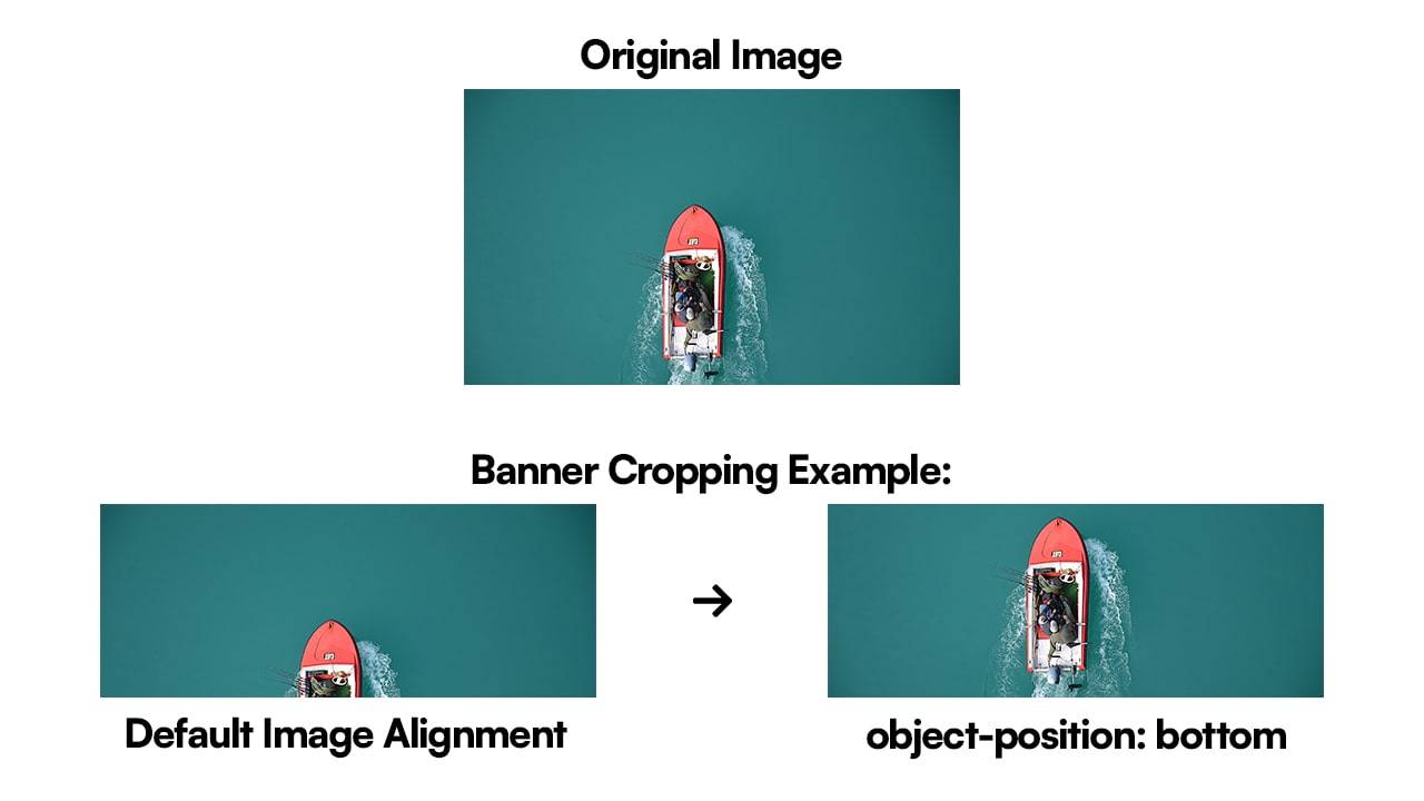
You've built out your amazing author experience inside the experience editor, only to have your users come back
and complain that the most important part of the image is cut off from your cropped banner! The easy fix for this is
to use the CSS property object-position on the image. However, you need to add a way to manage it on a
case-by-case basis, since every image your users upload will be different.
This guide aims to help solve any issues you encounter in Sitecore when correctly aligning images. We are going to
add the image object-position to Sitecore to give your users the ability to quickly align the image
however they would like!
What is Object-Position and Object-Fit
Object-position is the new CSS way to precisely position an image within its container. You can pair
this with object-fit to accomplish any image styling that you possibly need. This will allow you to solve
any CSS or Sitecore image alignment issues you might be having.
Object-Position
Popular use cases for object-position are:
- Centering Images
- Adjusting Image Cropping
- Creating Image Galleries
- Customizing Backgrounds
Object-position CSS values:
| Value | Description |
|---|---|
| center | Centers the object within its container horizontally and vertically. |
| top | Positions the object at the top of its container vertically, centering it horizontally. |
| bottom | Positions the object at the bottom of its container vertically, centering it horizontally. |
| left | Positions the object at the left of its container horizontally, centering it vertically. |
| right | Positions the object at the right of its container horizontally, centering it vertically. |
| top left | Positions the object at the top left corner of its container. |
| top right | Positions the object at the top right corner of its container. |
| bottom left | Positions the object at the bottom left corner of its container. |
| bottom right | Positions the object at the bottom right corner of its container. |
| center <percentage> | Centers the object horizontally and positions it vertically at the specified percentage of its container's height. |
| <percentage> center | Centers the object vertically and positions it horizontally at the specified percentage of its container's width. |
| <percentage> <percentage> | Positions the object at the specified percentage of its container's width and height. |
Object-Fit
Popular use cases for object-fit are:
- Scaling Down Image Sizes
- When you want to scale an image down to fit its container while preserving its aspect ratio without stretching or distorting it.
- Cropping
- When you need to crop an image to fit its container without distorting the aspect ratio, useful for maintaining consistency in layouts where images have different aspect ratios.
- Filling Containers
- When you want to fill the entire container with the image, possibly cropping parts of it, while preserving its aspect ratio. Useful for background images or in situations where the exact dimensions of the container are known and consistent.
- Covering Containers
- When you want to cover the entire container with the image, possibly clipping parts of it, while preserving its aspect ratio. Similar to filling, but ensures the image completely covers the container, potentially cropping parts of it.
- Fitting Content
- When you want the image content to fit entirely within the container without cropping or distortion, potentially leaving empty space if the aspect ratios don't match. Useful for ensuring complete visibility of the image content.
Object-fit CSS values:
| Property Value | Description |
|---|---|
| fill | The replaced content is sized to fill the element’s content box, maintaining its aspect ratio. Overflowing content may be cropped. |
| contain | The replaced content is sized to maintain its aspect ratio while fitting within the element's content box. No cropping occurs. |
| cover | The replaced content is sized to maintain its aspect ratio while completely covering the element's content box. Overflowing content is cropped. |
| none | The replaced content is not resized or scaled. It maintains its original size and aspect ratio. Overflowing content may be visible. |
| scale-down | The content is sized as if it were "none" or "contain", whichever results in a smaller concrete object size. |
Object-Position and Object-Fit Example Class:
You will be able to accomplish any image manipulation in Sitecore that you want by using object-position
and object-fit in a custom class. The most common use case for object-position and
object-fit to adjust image alignment is utilizing center and cover. This will
make sure the image is centered, and covers the entire visible area, ensuring no empty spaces on either side of the
image.
.image-fit {
    /* Center the image within its container horizontally and vertically */
    object-position: center center; /* same as: object-position: center; */

    /* Scale the image to fit its container, preserving its aspect ratio */
    object-fit: contain; /* Change this value as needed */
}
We can apply this class directly to our image elements:
<img className="image-fit" src=...>
Implementing Sitecore Image Object-Position
1. Sitecore: Configuring Style Buckets
Sitecore SXA introduces customstyle buckets, providing a convenient way for our authors and content editors to adjust CSS styling in Sitecore without requiring any CSS knowledge. We will leverage this functionality to offer users an effortless method to adjust image alignment directly within Sitecore!
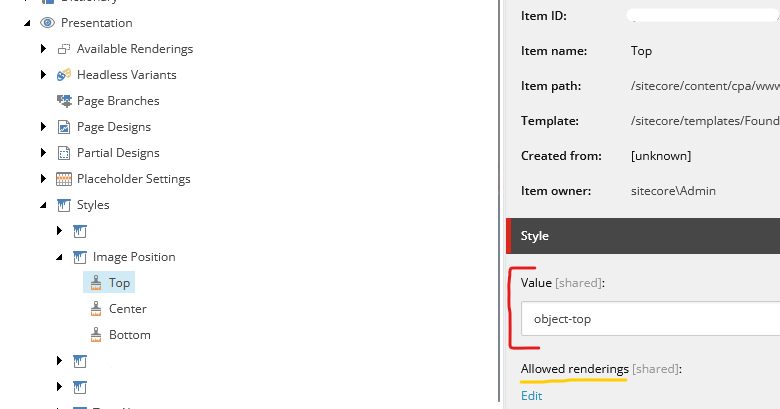
We can start by locating the “Styles” root item under “Presentation” and inserting a
Styles Controller, and calling it Image Position. After that, we can insert a
Style for each of the object-position that we want to provide to our authors. For the Value
of each Style, you can set it to the a custom CSS class (which you can add to your
globals.css file) or if you are using a utility system like bootstrap or tailwind, you can input the
correct class name for each item! I will be using the tailwindobject-position classes in the example.
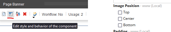
If you want to limit which authorable renderings have access to this style, you can add it to the “Allowed Renderings” box on each Style
Now these style classes are selectable inside the Experience editor, and your content authors will be able to select which options they want to apply.
2. Next.js: Component Updates
Inside our .tsx code, we will need to make sure we are pulling the style values from Sitecore. You
should be able to find them in `props.params?.Styles`. This should return an object of all your authors
selected style options.
Note: If your author has not selected any styles in the Experience Editor then you will receive an
undefined.
If we console.log this value out to the browser, you will see a space delimited list of all the
Styles your authors have selected. In the above example i only have the one tailwind class
object-top. If your authors have selected multiple styles and you want all those style on the same html
element, then you can simply add the `props.params?.Stylesdirectly into yourclassName`.
Otherwise, you will need to write some custom logic to segregate and organize the incoming classes.
Since we only have the 1 incoming class, we can add it directly to our <img> tag’s
className.
<div>
    <Image
      className={`${props.params?.Styles} h-full max-h-56 w-full`}
      field={props?.fields?.image}
    />
</div>
Page-Level: Setting Image Positioning (Optional)
1. Sitecore: Linking Your Style Bucket to a Page-Level Item
Next, we want to enable the same functionality for our Content authors who are writing content in the Content Editor and may not have access to the Experience Editor. This is very apparent when authored pages and content pages use a different page template - mainly when content pages are not authorable though the experience editor.
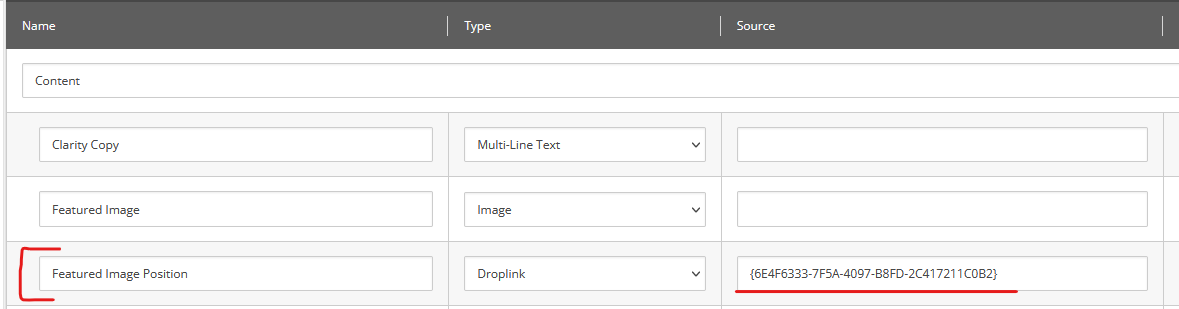
First you want to copy the Item id from our Image Position Style Controller.
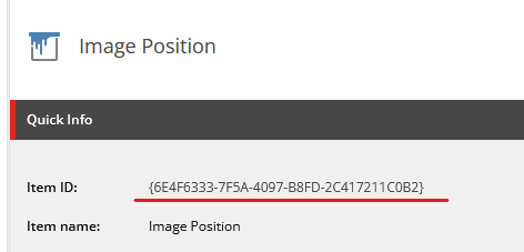
We then want to find the base template for the content page we want to add this functionality to. Once there, add a
new Droplink item and call it __ Image Position. We then want to paste the
Item id of our Image Position item into the Source column. This will link the
new Droplink with the already created Style Controller.
Remember to keep in mind any inheritance that your content page templates might use.
2. Next.js: Component Updates
Altering our .tsx code for static templates is even simpler than the authorable
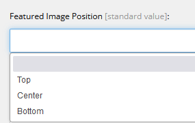
components. We just need to find our __ Image Position field inside SitecoreContext. Since I
wanted to alter my Featured Image, I will look for the Featured Image Position and insert the value into
a new variable, and set a fallback default value.
const { sitecoreContext } = props;

const imageStyling =
  sitecoreContext.route.fields['Featured Image Position']?.fields?.Value?.value ??
  'object-center';
Then, like for authored components, you only need to add the exported imageStyling into the
className.
<div>
    <Image
      className={`${ImageStyling} h-full max-h-56 w-full`}
      field={props?.fields?.image}
    />
</div>
Utilizing Object Position in Sitecore
Utilizing Sitecore’s Style Buckets is extremely powerful and has the potential to provide your authors with unlimited precision. You can take it much further than just adjusting image object positions; you can configure it to work with any CSS classes! Hopefully, this guide has provided you with all the initial knowledge you'll need to make that a reality.

Meet Tyler Holmes
Full Stack Developer
🇬🇧🧑💻🏸
Tyler is an experienced Full Stack Developer who has worked on a plethora of unique projects. He possesses a deep understanding of Technical SEO, C#, and React/Next.js.