Unlocking Sitecore Development with Storybook: A Step-by-Step Guide
Lets learn how to effectively mock up components for Sitecore in Storybook. Doing so can have a significant impact on the success of your website development projects. If the components are built using @sitecore-jss/sitecore-jss-nextjs library components, then they will be compatible with Sitecore Item field data, when rendered with Sitecore, and function as expected in Experience Editor and Preview/Published view.
Why use Storybook?
Storybook allows us to build components for Sitecore while being completely disconnected from a Sitecore environment. This means that developers who are not familiar with Sitecore are able to create, test, and debug components. This may be the case for new developers or developers who are focused solely on front end development. It can also be useful in developing components in isolation of each other.
Creating a Component in Storybook
This blog assumes you have already installed Storybook in your headless solution and have some basic understanding of it and will not be covering this.
As with all our Headless Sitecore XM Cloud components, they exist as .tsx files in src/components and will ultimately be referenced in Sitecore via a JSON Rendering. However, we do not have to worry about the Sitecore details for now.
In the rendering folder of our solution we have the folder src/stories which contains *.stories.tsx files. Our Storybook files will import the component files and will populate the properties/data that we have defined as part of the UI. We need our stories data to follow a certain object structure or else it will not work when we try and translate this component into Sitecore. Below, I will go over some examples of how object structure would look for certain field types.
Sitecore Component Props to Mock
The code snippet below contains the properties of the component we want to mock out in Storybook. All of these interfaces are imported from the Sitecore JSS/Next.js library:@sitecore-jss/sitecore-jss-nextjs. Typically all Fields have a value property which is populated via the Sitecore CMS.
type MyComponentProps = ComponentProps & {
  fields: {
    heading: TextField;
    body: RichTextField;
    image: ImageField;
    link: LinkField;
    imageLeft: {
      value: boolean;
    };
  };
};
Single-line Text / Rich Text
The most basic Field type is the Single-line Text or Rich Text which just have a string value. In your Storybook file, they are mocked out as such:
heading: {
      value: 'Headline',
},
body: {
      value: 'Lorem ipsum',
},
General Links
A General Link has a more complex structure as it has more properties.
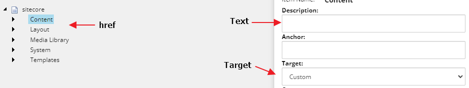
The object returned from a LinkField in Sitecore has the following structure:
link: {
      value: {
        href: '/',
        target: '',
        text: 'Primary Action',
      },
    },
Image
The object returned from an ImageField in Sitecore has the following structure:
image: {
      value: {
        src: '',
        alt: '',
      },
    },
Boolean
There is no Checkbox interface in the jss-nextjs library, as seen in our above properties. The object is simple like the Single-line text and contains a boolean as the value. The object returned from a Checkbox field in Sitecore has the following structure:
imageLeft: {
      value: true,
    },
Sitecore Datasource Check Component
Components that require data sources in Sitecore XM Cloud should utilize the withDatasourceCheck component on our export in our *.tsx component like so:
export default withDatasourceCheck()<MyComponentProps>(MyComponent);
Thus to pass this check in Storybook, we need to create a file called helper.ts in the stories folder that will populate the required fields and allow it to render.
// without this, storybook complains that a component does not have a datasource and will show an error component.
export const withDatasourceCheckComponentArgs = {
  rendering: {
    componentName: 'Rendering',
    dataSource: '/sitecore',
  },
};
This will need to be imported into each of our *.stories.tsx files. You will see below how we pass this in as one of our arguments in our Component object.
import { withDatasourceCheckComponentArgs } from '../helper';
Putting It All Together
Here is the final product when we tie everything we have learned above into our Storybook file. If done correctly, we will see our component rendered out correctly in Storybook and also be fully compatible with Sitecore when the time comes to render it in our CMS.
import React from 'react';
import { ComponentStory, ComponentMeta } from '@storybook/react';
import MyComponentfrom '../../components/Feature/MyComponent';
import { withDatasourceCheckComponentArgs } from '../helper';

export default {
  title: 'Banner',
  component: MyComponent,
  parameters: {
    layout: 'fullscreen',
  },
} as ComponentMeta<typeof MyComponent>;

const Template: ComponentStory<typeof MyComponent> = (args) => <MyComponent{...args} />;

export const Component = Template.bind({});

Component.args = {
  ...withDatasourceCheckComponentArgs,
  rendering: {
    componentName: 'MyComponent',
    dataSource: 'MyComponentDatasource',
  },
  fields: {
    heading: {
      value: 'Headline',
    },
    body: {
      value:
        'Lorem ipsum dolor sit amet, consectetur adipiscing elit, sed do eiusmod tempor incididunt ut labore et dolore magna aliqua',
    },
    link: {
      value: {
        href: '/',
        target: '',
        text: 'Primary Action',
      },
    },
    image: {
      value: {
        src: '',
        alt: '',
      },
    },
    imageLeft: {
      value: true,
    },
  },
};
Empowering Your Sitecore Journey with Storybook
In wrapping up, leveraging Storybook to mock up components for Sitecore projects not only streamlines the development process but also ensures a seamless integration with the Sitecore CMS. By following the outlined steps and utilizing the @sitecore-jss/sitecore-jss-nextjs library, developers can create components that are fully compatible with Sitecore, enhancing both the developer experience and the end-user interaction with the website. Embrace this guide to elevate your Sitecore projects, ensuring that each component you develop is robust, reusable, and ready for the dynamic content management that Sitecore provides.

Meet Mike Payne
Development Team Lead
🎶🚴♂️⛰
Mike is a Development Team Lead who is also Sitecore 9.0 Platform Associate Developer Certified. He's a BCIS graduate from Mount Royal University and has worked with Sitecore for over seven years. He's a passionate full-stack developer that helps drive solution decisions and assist his team. Mike is big into road cycling, playing guitar, working out, and snowboarding in the winter.