Harnessing Storybook 7 for Enhanced UI Mockups
Storybook is a tool used to build UI components in isolation and provide ways to test them without the need for the complexity of having to add data, APIs, or business logic. An efficient way of creating components where it can mock in different scenarios and variations separately.
With the new updates in Storybook (version 7.*), they have made creating stories more seamless and powerful. Let’s dive into some of the ways to utilize these enhancements and try to improve how we create our component stories.
1. Build the Test Component
First, let’s start with creating a simple reusable component. When starting a project we usually first work on the small reusable components that we expect to use or import into future components. One of the vital ones we expect to add to almost all of our pages is a Button.
import React from "react";

interface ButtonProps {
    label: string;
    color: 'bg-red-100' | 'bg-blue-100' | 'bg-yellow-100';
}

/**
 * Primary UI component for user interaction
 */
export const Button = ({
  ...props
}: ButtonProps) => {
  const classes = ["btn p-4"];

    if (props.color) {
        classes.push(props.color);
    }
  return (
    <button type="button" className={classes.join(" ")}>
      {props.label}
    </button>
  );
};
The following are important tips to note in the code above.
- Defining the types of our props is vital since Storybook uses these to generate its autodocs, **comprising of controls and definition of props.
interface ButtonProps {
    label: string;
    color: 'bg-red-100' | 'bg-blue-100' | 'bg-yellow-100';
}
- When knowing exactly the multiple options possible for a specific prop in our component,
colorcan use string, and it should still be correct, but going the extra step and defining what strings or exact colours are allowed will help make our story easier to manage and test.
2. Creating our Storybook Story
import { Button } from "../../components/Shared/Button";
import type { Meta, StoryObj } from "@storybook/react";

const meta: Meta<typeof Button> = {
  title: "Elements/Button",
  component: Button,
  tags: ["autodocs"],
  argTypes: {},
};

export default meta;
type Story = StoryObj<typeof Button>;

export const Default: Story = {
  args: {
    label: "Button text",
        color: "bg-red-100",
  },
};
Inside the meta-object, we have autodocs defined as one of the elements in tags. Instead of manually creating each component’s docs page, Storybook has added a feature where it checks the component and creates the documentation for you.
Every export const generates a separate Story page, which is defined based on the variable name. Here, we have it exporting Default, so the story will be defined as Default.
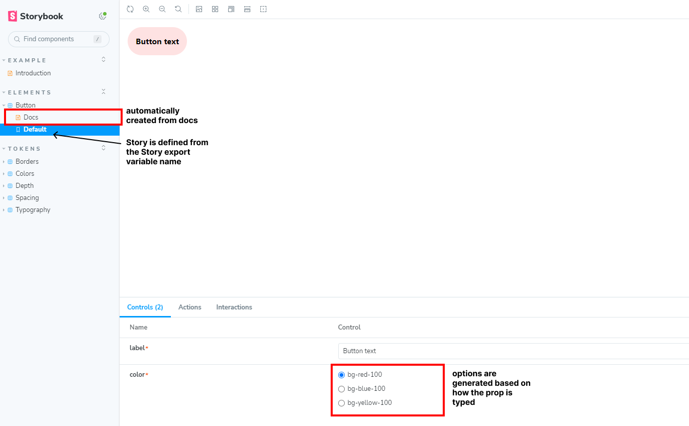
The autodocs is a powerful feature which helps create stories faster and cleanly. However, as components need to satisfy some requirements, we’ll have to find ways to customize our stories to create a seamless user-friendly experience when testing on Storybook.
3. Handling Complex Components
Let’s start from scratch and adjust our Button to some criteria needed. This is a close replica of how fields might be managed in an XMCloud project.
import React from "react";

export type ButtonColorType = 'bg-red-100' | 'bg-blue-100' | 'bg-yellow-100';

interface Fields {
    label: {
    value: string
  };
    color: {
    value: ButtonColorType;
  };
}

interface ButtonProps {
    fields: Fields;
}

/**
 * Primary UI component for user interaction
 */
export const Button = ({
  ...props
}: ButtonProps) => {
  const classes = ["btn p-4"];

    if (props.fields.color.value) {
        classes.push(props.fields.color.value);
    }
  return (
    <button type="button" className={classes.join(" ")}>
      {props.fields.label.value}
    </button>
  );
};
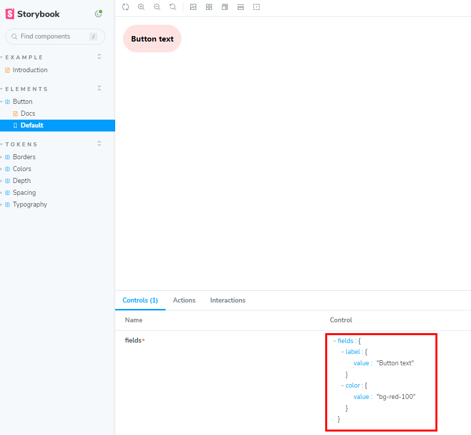
We can simply mock and modify our story file based on how the props are needed. We’ll have to modify some parts of the story file to be able to get the fields to use the right input type. By default, Storybook doesn’t support nested objects and would just use a simple text input if you do so.
import { Button } from "../../components/Shared/Button";
import type { Meta, StoryObj } from "@storybook/react";

const meta: Meta<typeof Button> = {
  title: "Elements/Button",
  component: Button,
  tags: ["autodocs"],
  argTypes: {},
};

export default meta;
type Story = StoryObj<typeof Button>;

export const Default: Story = {
  args: {
    fields: {
      label: { value: "Button text" },
      color: { value: "bg-red-100" },
    },
  },
};
The problem now is because the fields are now objects, they are handled differently in the autodocs.
Let’s make some enhancements to the code that generates the docs in order to get a more user-friendly experience when going over the story in Storybook.
import { Button, ButtonColorType } from "../../components/Shared/Button";
import type { ArgTypes, Meta, StoryObj } from "@storybook/react";
// Typing our fields in the Story Controls
type ButtonProps = {
label: string;
color: ButtonColorType;
};
const meta: Meta<typeof Button> & {argTypes?: Partial<ArgTypes<ButtonProps>>} = {
title: "Elements/Button",
component: Button,
tags: ["autodocs"],
// Some fields may need their input controls be specified here.
argTypes: {
'color': {
options: ['bg-red-100', 'bg-blue-100', 'bg-yellow-100'],
control: { type: "radio" },
},
},
};
export default meta;
// Mapping out the controls in the right format accepted by the component
const ButtonFields = (args: ButtonProps) => {
return {
label: {
value: args.label,
},
color: {
value: args.color as ButtonColorType,
},
};
};
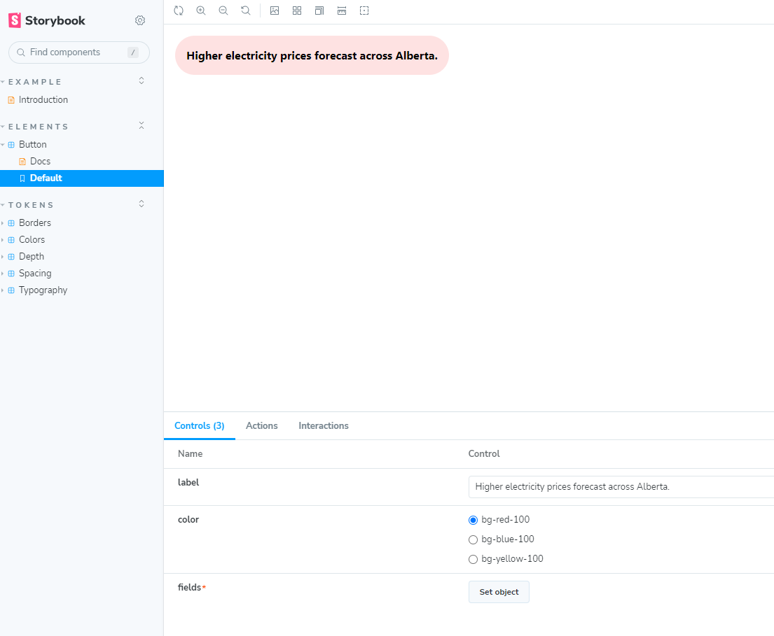
export const Default = {
args: {
label: "Higher electricity prices forecast across Alberta.",
color: "bg-red-100",
},
render: (args: { label: string; color: ButtonColorType }) => (
<div className="flex w-full">
<Button fields={ButtonFields(args)} />
</div>
),
};
This might look a lot, especially with how the initial code looks like. We have to supply Storybook with the right stuff in order for typing and linting to work properly and cleanly. Let’s break the code into parts and talk about each part.
import { Button } from "../../components/Shared/Button";
import type { Meta, StoryObj } from "@storybook/react";

const meta: Meta<typeof Button> = {
  title: "Elements/Button",
  component: Button,
  tags: ["autodocs"],
  argTypes: {},
};

export default meta;
type Story = StoryObj<typeof Button>;

export const Default: Story = {
  args: {
    fields: {
      label: { value: "Button text" },
      color: { value: "bg-red-100" },
    },
  },
};
This part will help let Storybook know that there are more fields to add to the Story without having to modify our component just to satisfy Storybook. The ButtonProps contain the fields we want to add to the Storybook controls, which do not look one-to-one with the component.
argTypes: {
    'color': {
      options: ['bg-red-100', 'bg-blue-100', 'bg-yellow-100'],
      control: { type: "radio" },
    },
  },
String types are the easiest to handle, but there will be moments Storybook’s autodoc doesn’t use the right input we want. Check out the Storybook docs for more about specifying controls. Sadly, this out-of-the-box doesn’t work for objects as we expect it to do.
const ButtonFields = (args: ButtonProps) => {
  return {
    label: {
      value: args.label,
    },
    color: {
      value: args.color as ButtonColorType,
    },
  };
};

export const Default = {
  args: {
    label: "Higher electricity prices forecast across Alberta.",
    color: "bg-red-100",
  },
  render: (args: { label: string; color: ButtonColorType }) => (
    <div className="flex w-full">
      <Button fields={ButtonFields(args)} />
    </div>
  ),
};
The rest of the code is just connecting the arguments provided by the controls of Storybook into the component props.
Finally, we have a better story we can test on Storybook, which looks very close to how that simple component renders. This is a pretty simple component but a good stepping stone to practice on.

Meet John Flores
Front-End Developer
🪴🐩📷
John is a Front-End Developer who is passionate about design and development. Outside of work, John has wide range of hobbies, from his plant collection, being a dog daddy, and a foodie.