Introduction to Creating a Photo Card Component in Sitecore
In the world of Sitecore development, creating custom components is a fundamental skill that enables developers to tailor the content management experience to specific needs. In this comprehensive guide, we'll delve into creating a Photo Card component in Sitecore.
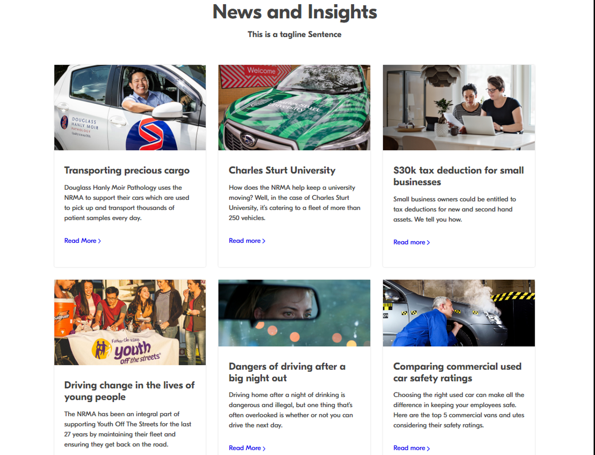
A Photo Card serves as a visually appealing way to highlight key content. It typically includes an image, a title, a description, and a “Read More” link. These components are versatile and can be adapted for various content types and design schemas.
Requirements for the Photo Card Component
Before diving into the creation process, let’s outline the requirements (which may vary according to business requirements):
- Header and Blurb: Each Photo Card should have a distinct header and a short descriptive blurb.
- Responsive Design: The layout should support a maximum of three Photo Cards per row in desktop view and a stacked arrangement in mobile view.
- Content Structure: Each card will feature a full-size image at the top, followed by a title, a description, and a “Read More” link.
- Dynamic Content Sourcing: The component should fetch content from an internal news item page if the datasource is empty.
- Editable Content: All elements should be editable through the Sitecore Content Editor.
Step-by-Step Creation Process
Step 1: Template Creation within Sitecore CMS
Templates act as blueprints for our component. The PhotoCardIntro handles the header,
while PhotoCardTeaser deals with the main content. This separation of concerns
simplifies future modifications and enhances maintainability.
-
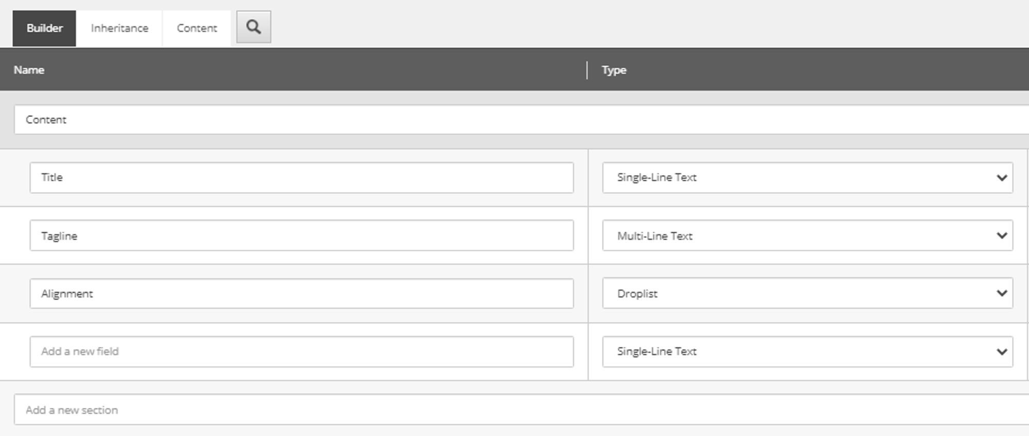
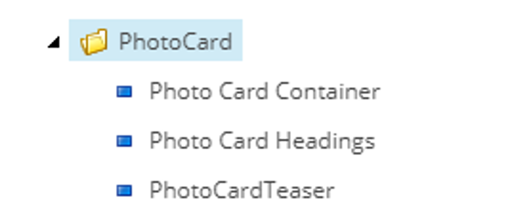
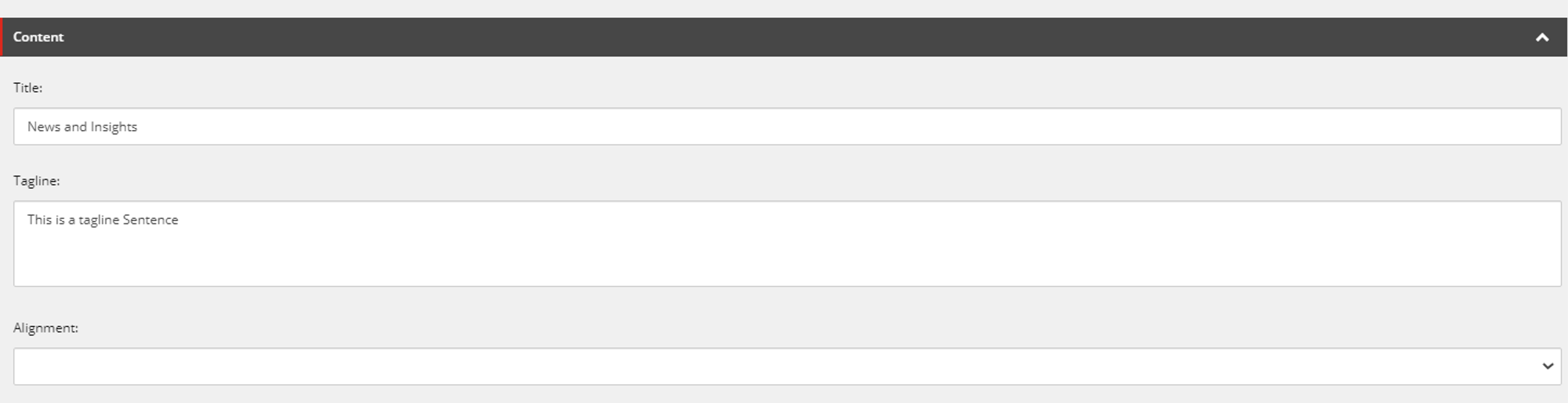
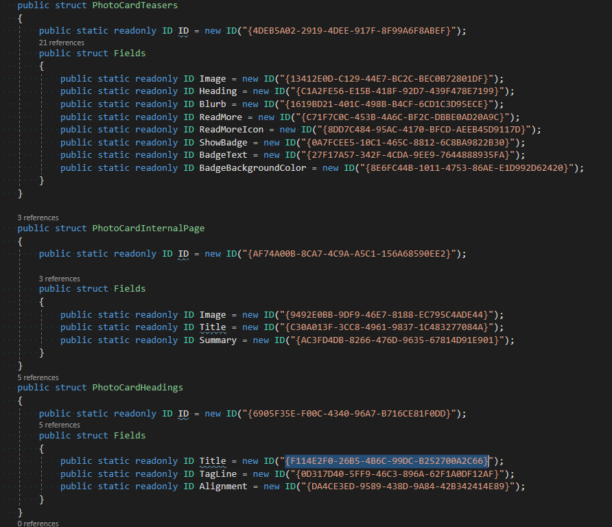
Create a new template under
Sitecore/Templates/Feature/SimpleContent/PhotoCard(you can use your own path within templates). - Define fields for the Title, Tagline, and Alignment in the PhotoCardIntro template.
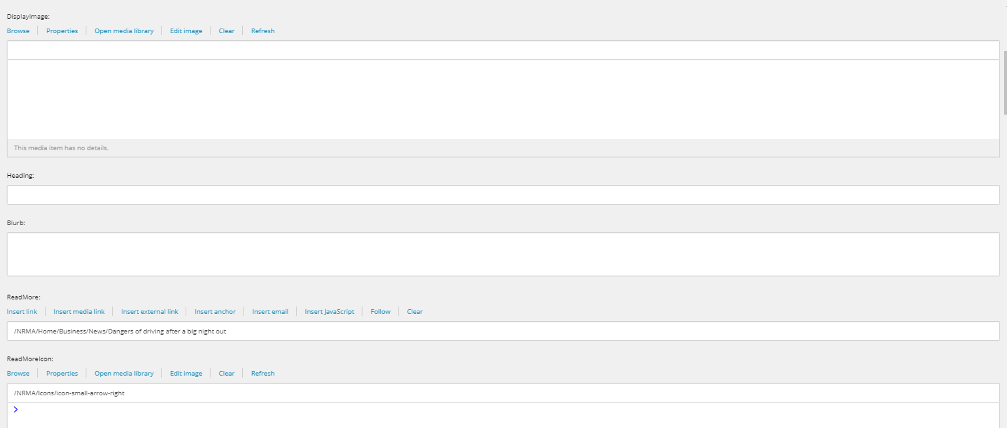
- Repeat the process for the PhotoCardTeaser template, which will hold the main content.
Step 2: Rendering Setup
View rendering allows us to define the structure of our component, while controller renderings link the backend logic with the frontend. This MVC approach ensures a clean separation between the presentation layer and business logic.
-
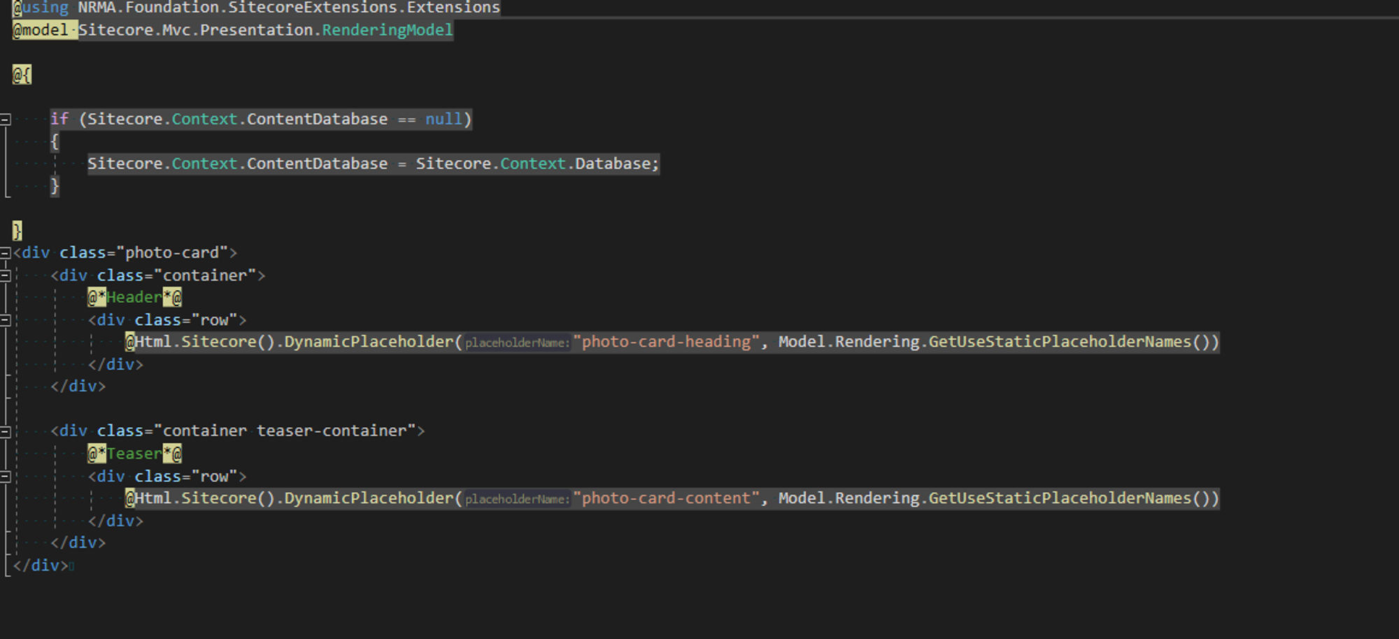
In
Sitecore/Layout/Renderings/Feature/SimpleContent/PhotoCard, add a View rendering for the container and Controller renderings for the headings and teaser content.
Step 3: Datasource Creation
- Create a ‘PhotoCard’ page inside home and use the ‘PhotoCardIntro’ and ‘PhotoCardTeaser’ templates we created earlier to set up the data sources.
Step 4: Model Development in Visual Studio
Models represent our component's data structure in the code. They act as a bridge between Sitecore's content and the rendering layers, ensuring data consistency and integrity.
-
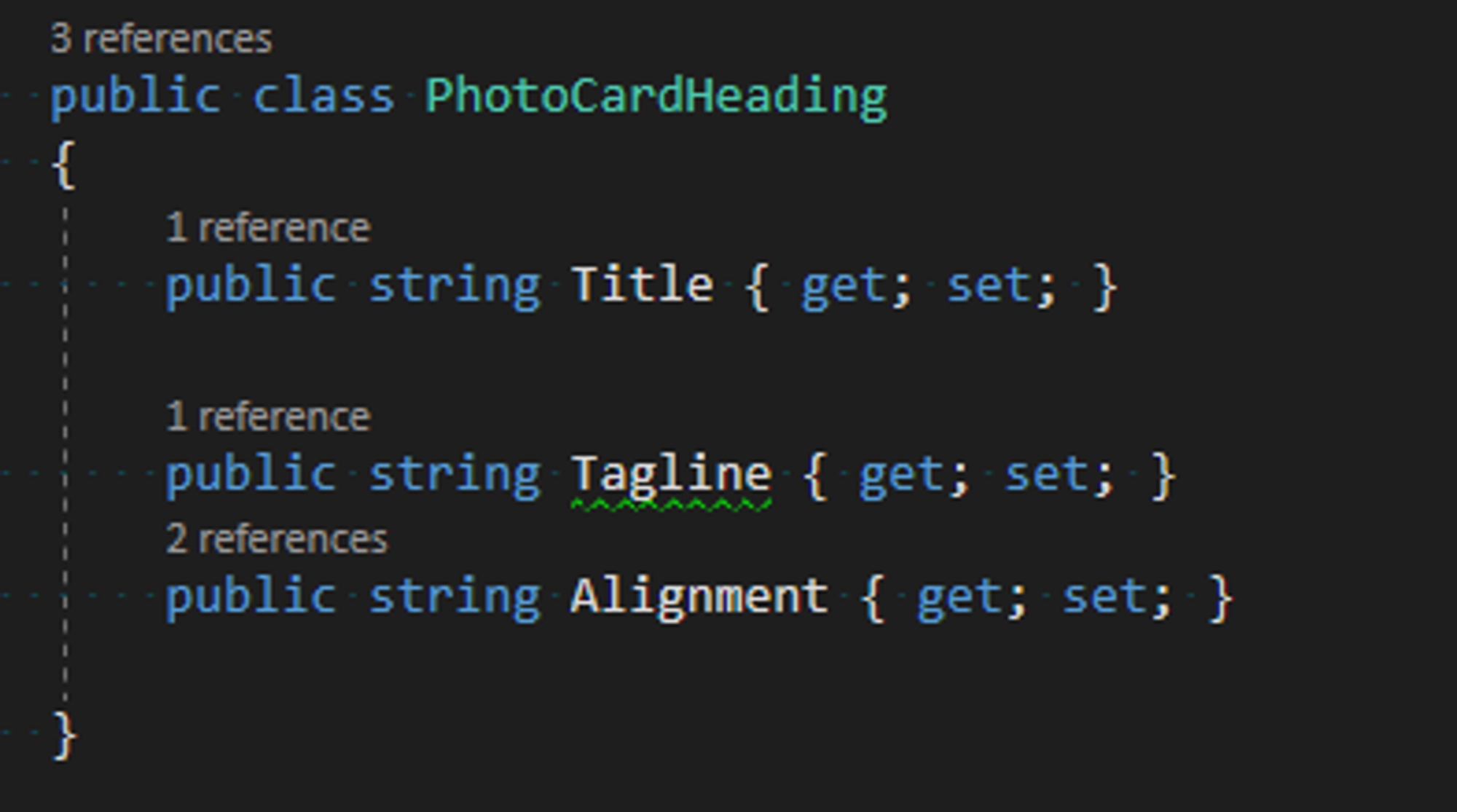
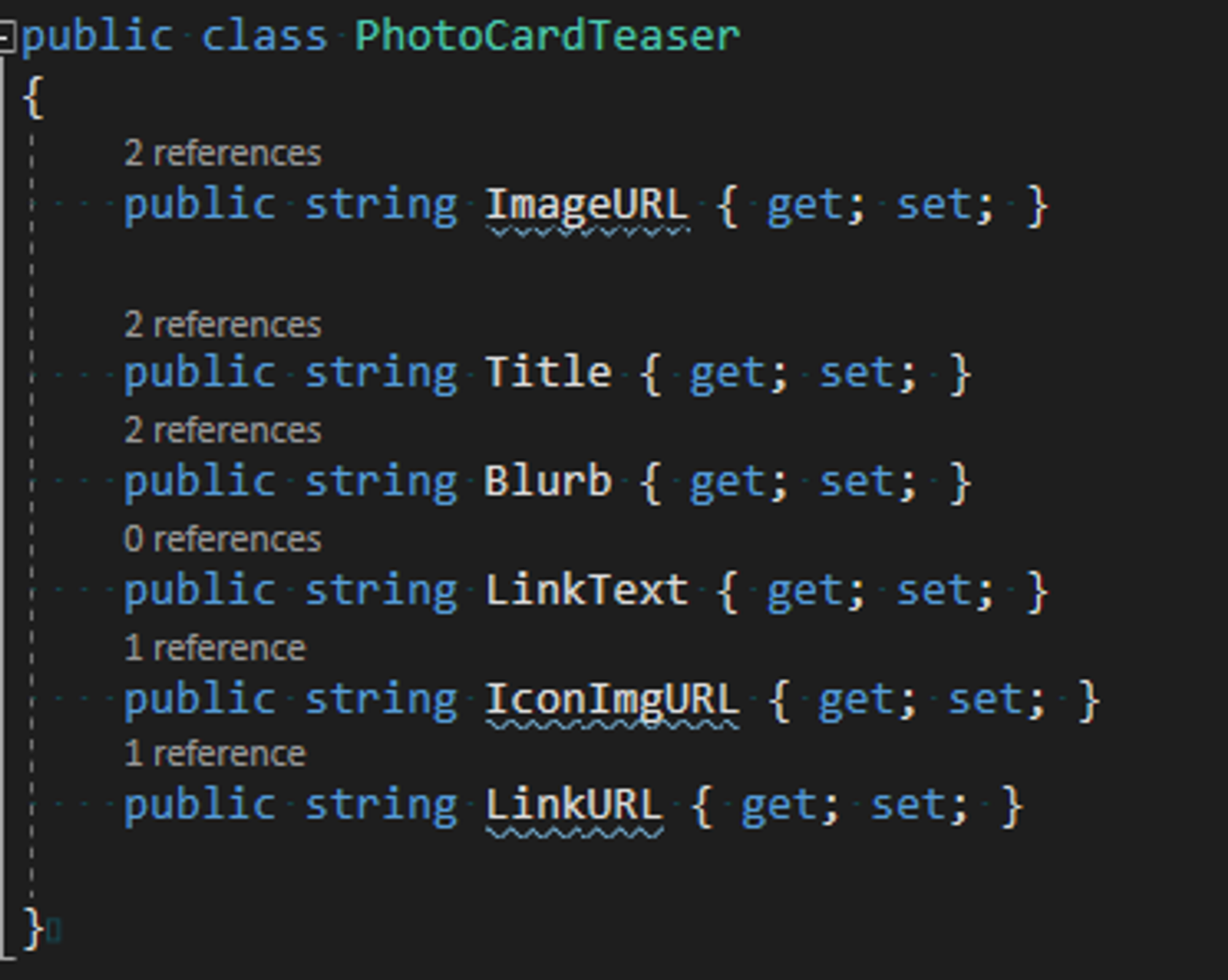
Develop
PhotoCardHeadings.csandPhotoCardTeaser.csmodels in the ‘SimpleContent’ feature’s Models folder.
Step 5: View Creation
This step involves creating the visual aspect of our component. By connecting views to models, we ensure that any content changes in Sitecore are accurately reflected on the website.
-
Define the IDs of all your Sitecore templates within the
Templates.csclass. -
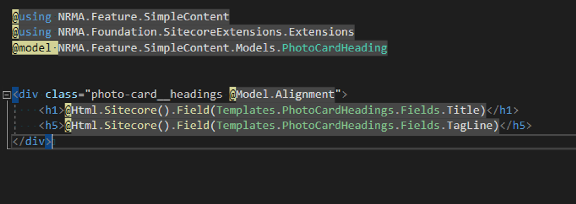
Create
PhotoCardContainer.cshtml,PhotoCardHeading.cshtml, andPhotoCardTeaser.cshtmlin the Views folder, linking them to their respective models.
Step 6: Controller Implementation
Before we dive into the development of controllers where the main logic resides, we need to understand the component logic and data flow.
- Data Source and Linking Logic:
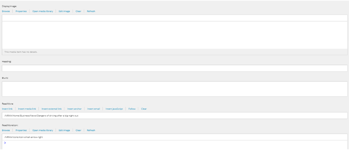
- The Photo Card component retrieves its content (image, title, description) from an internal news item page.
- This is achieved by linking the "Read More" item in the Photo Card to the news item page, using Sitecore's internal linking capabilities.
- The "Read More" field in the Photo Card's data source holds the link, with the link description being the visible text.
- TargetID Extraction and Usage:
- The code logic involves extracting the TargetID from the ReadMore field, which identifies the news item template being pointed to.
- By default, the Photo Card fetches values (image, title, description) from the linked news item page.
-
Overriding Functionality:
- The Photo Card allows for an override if the data source is explicitly populated.
- When the data source is empty, the default (targeted news item) content is used.
-
If the data source is populated, these values take precedence and are displayed.
Controller Actions and Code Implementation
-
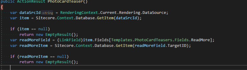
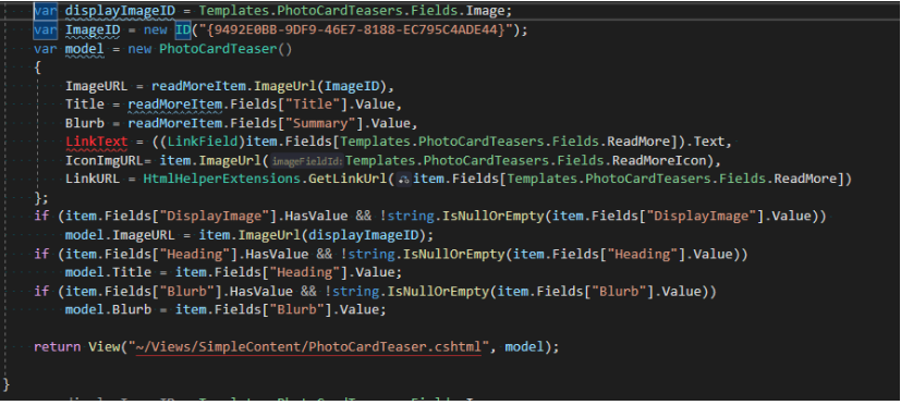
PhotoCardTeaser ActionResult:
- This action handles the teaser content for the Photo Card.
-
It includes logic for fetching default content from the targeted news item or using overridden values from the data source.
-
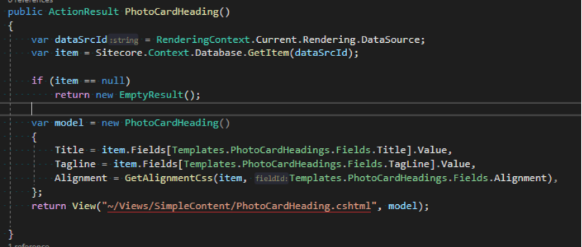
PhotoCardHeading ActionResult:
- Manages the header content for the Photo Card, such as titles and taglines.
-
Utilizes the
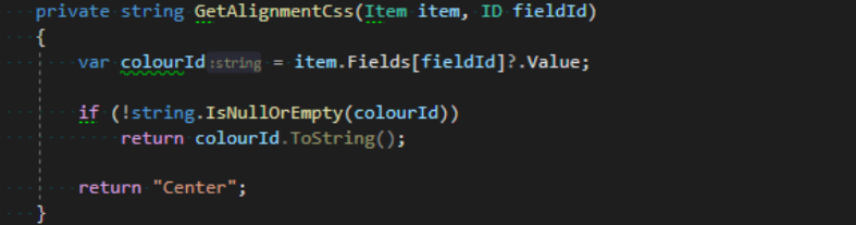
GetAlignmentCssmethod to determine the CSS class for alignment, based on the selection in the Sitecore template. -
Defaults to center alignment if no specific alignment is selected.
Rendering Path Configuration:
After creating your controllers, ensure that Sitecore is configured to recognize the exact names of the Controllers and ActionResults.. This is done as follows:
-
For the “PhotoCard Container” view rendering, the path is set to
/Views/SimpleContent/PhotoCardContainer.cshtml. -
The controller name for “PhotoCard Headings” and “PhotoCardTeaser” is set to “PhotoCard”, with respective actions “PhotoCardHeading” and “PhotoCardTeaser”.
Now you have your custom photocard component ready and the only thing left is styling as per your requirements.
Step 7: Styling
The Razor views we created above takes care of most of the alignment and structuring. Now we can add our styling to the component as per the business requirements:
- Add a SCSS file named PhotoCard.scss to style the component according to the project’s design guidelines.
Deep Dive: Best Practices and Advanced Insights
- Responsive Design Considerations: When designing the layout, it's crucial to consider various screen sizes and devices. Use CSS media queries to ensure a seamless experience across devices.
- SEO Optimization: Ensure that the image alt texts, titles, and descriptions are SEO-friendly to enhance the component’s search engine visibility.
- Performance Optimization: Optimize image sizes and implement lazy loading to improve page load times.
- Accessibility: Ensure that the component is accessible, with proper ARIA labels and keyboard navigation.
- Sitecore Helix Principles: Follow Sitecore Helix guidelines for a scalable and maintainable architecture.
- Utilize the official Sitecore documentation of MVC for best results MVC | Sitecore Documentation.
Conclusion
Creating a Photo Card component in Sitecore involves a meticulous understanding of both design and development principles. By following the steps outlined in this guide, developers can build a component that is not only visually appealing but also functional and user-friendly.
This deep dive into creating a Photo Card component in Sitecore illustrates the blend of creativity and technical skill required in modern web development. By adhering to best practices and focusing on user experience, developers can create components that significantly enhance the effectiveness of a website.

Meet Usman Ghazi
Developer
🏋️♂️🎬🏞️
As a seasoned Full Stack Developer specializing in Sitecore with experience ranging across Australia and Canada, I blend technical expertise with a zest for life's adventures. Outside the digital realm, I'm an avid mixed martial artist, TV show enthusiast and hiking aficionado, always ready to explore new trails and travel around the world.