Introduction
This article will teach you how to use Bootstrap's order class to re-order your columns for mobile use. Please read my previous article if you are on Bootstrap 3.
Prerequisites
Knowledge of Bootstrap's grid system. You can read up on Bootstrap 4(B4)'s grid system here and Bootstrap 5(B5)'s system here.
Order Classes
Use the .order- classes to control the visual order of your content.
In B4, you can use 1 - 12 across the 5 grid sizes, and in B5,
you can use 1 - 5 across 6 grid sizes.
You can use .order-first and .order-last as well.
order-first will appear in front of order-1, and
order-last will appear behind order-12.
Order Class Example

Click here to see the code.
You'll notice that the columns are No order class first
followed by order-2 and then order-1 in the code, however,
the order-1 column is displayed first on the webpage.
Reordering For Mobile
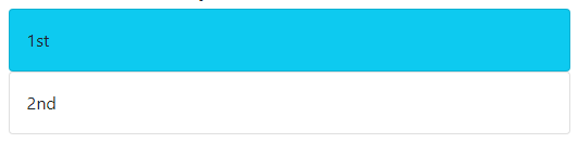
With Bootstrap, you need to have a mobile first mindset, so set up your classes for mobile first, before putting in the classes. Here's what I've done for a two column example.
The Code
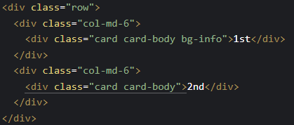
Desktop View

Mobile View
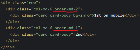
We want the blue column to appear second on desktop. We can do that by adding
an order class to the same class as col-md-6. Add order-md-2 to
the class list, and then add order-md-1 to the white column, so that
it appears first. Here's what it should look like:
The New Code
New Desktop View

New Mobile View
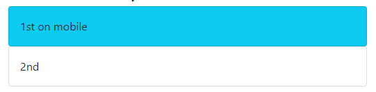
The blue column now appears second on desktop view, but still first on a mobile phone.
Note: Remember to match grid sizes. In our example we used md, but
we can use sm, lg, etc. Check the Bootstrap page for
all available sizes.
Help, I've designed for desktop first!
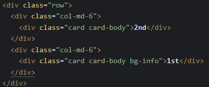
Code
Desktop View

Mobile View
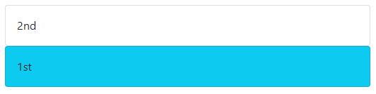
In this example, you'll notice that we've designed for desktop first, and the blue column is where we want it to be,
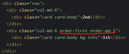
but we want to to be on top for mobile. To make the blue box appear first, we will add order-first order-md-*
where * can be 1 - 12 in B4, and 1-5 in B5.
New Code
New Desktop View

New Mobile View
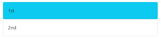
The blue column now appears on top for mobile!
Click here to see the code for the examples above.
Conclusion
Thank you for reading this blog! I hope it helped you better understand column reordering for mobile.
👋 Hey Sitecore Enthusiasts!
Sign up to our bi-weekly newsletter for a bite-sized curation of valuable insight from the Sitecore community.
What’s in it for you?
- Stay up-to-date with the latest Sitecore news
- New to Sitecore? Learn tips and tricks to help you navigate this powerful tool
- Sitecore pro? Expand your skill set and discover troubleshooting tips
- Browse open careers and opportunities
- Get a chance to be featured in upcoming editions
- Learn our secret handshake
- And more!


Meet Gorman Law
Full Stack Developer
🏋️🎸🏈
Gorman is a Full Stack Developer and a University of Calgary alumni who has a background in Canada's financial industry. Outside of work, he likes to go rock climbing, try out new ice cream places, and watch sports.