Bootstrap is well known for it's grid system, and today we're going to look at a lesser known grid feature known as column reordering. In particular, we will be looking at using push and pull in Bootstrap 3.
Prerequisites
Bootstrap 3 is an older version, but many websites still use it! In the head of your HTML document copy the following text.
link rel="stylesheet" href="https://stackpath.bootstrapcdn.com/bootstrap/3.4.1/css/bootstrap.min.css" integrity="sha384-HSMxcRTRxnN+Bdg0JdbxYKrThecOKuH5zCYotlSAcp1+c8xmyTe9GYg1l9a69psu" crossorigin="anonymous">
If you are not already familiar with Bootstrap's grid system, here is a link to brush up on your knowledge.
Understanding Column Reordering
First, let's look at a quick example of what we mean by column reordering.
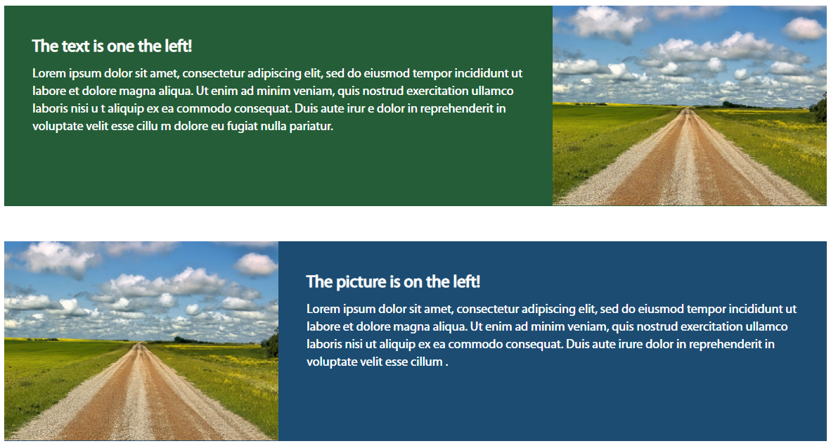
The image above is two components made for the desktop view. A small image to the left or right, and a bigger space for text. Let's look at what happens in mobile view.
As expected, the columns rearrange on top of each other. But we don't want the image below the text in the first component, we want the image to appear on top in both components.
Here are the classes used to create the images above.
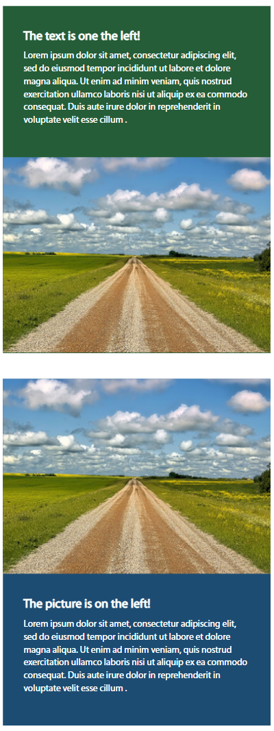
And here's what it looks like in mobile.
We want the smaller section (blue) to appear on the top, and to do that we can use Bootstrap's push and pull classes.
Push and pull and pull and push
Firstly, we must remember that Bootstrap CSS Framwork is mobile first. So let's start with writing our markup with the smaller column on top.

Next we add the push and pull classes. Don't forget that Bootstrap is based on a 12 point grid system.

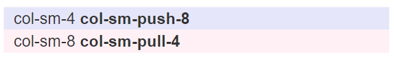
We use push to push the column we want to the right, and
pull to pull the column we want from the right.
Multiple column reordering
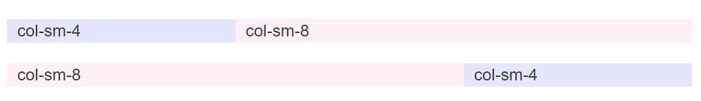
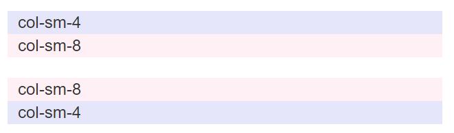
We can do pull and push with multiple columns as well. Take a look at the following.

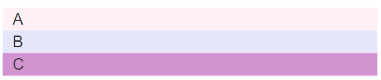
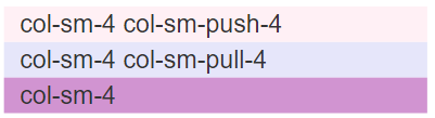
Here, we add the push class to A, and pull to B

Bootstrap 4 and 5 and 6(?)
Unfortunately, pull and push were removed in Bootstrap 4, but fret not, check back soon for another column reordering tutorial for the latest versions of Bootstrap.