What is a Burndown Chart?
The burndown chart is a graphical representation of the work completed versus the work remaining in a sprint. As the sprint progresses, the chart visually illustrates how much work is left to be done and whether the team is on track to complete it within the allocated time frame.
The burndown chart usually consists of:
- X axis to display working days
- Y axis to display remaining effort/story points
- Ideal effort/trend as a guideline (grey line in the image below)
- Ideal capacity (green line in the image below)
- Real progress of effort (blue area in the image below)
Why is the Burndown Chart important for project teams and Project Managers?
The burndown chart serves multiple purposes within Agile project management:
- Progress Tracking: It provides a clear snapshot of the team's progress throughout the sprint, allowing project managers to gauge whether the project is proceeding as planned or if adjustments are necessary.
- Forecasting: By extrapolating the current sprint trajectory, teams can forecast whether they will meet their sprint goals. This enables proactive decision-making to address any potential roadblocks or scope changes.
- Identification of Issues: Sudden deviations or anomalies in the burndown trend can signal underlying issues such as scope creep, resource constraints, or technical challenges. Early detection empowers teams to address these issues promptly.
- Communication Tool: The burndown chart serves as a communication tool, fostering transparency and alignment among team members, stakeholders, and product owners. It provides a common understanding of the project's status and facilitates collaborative problem-solving.
Understanding the DevOps Burndown Chart
Understanding how to interpret the burndown chart is essential for deriving actionable insights. Below are some examples of some good and not quite so good situations a project team may be facing during a sprint. There are obviously many other situations in between the ones presented below, but here are some examples:
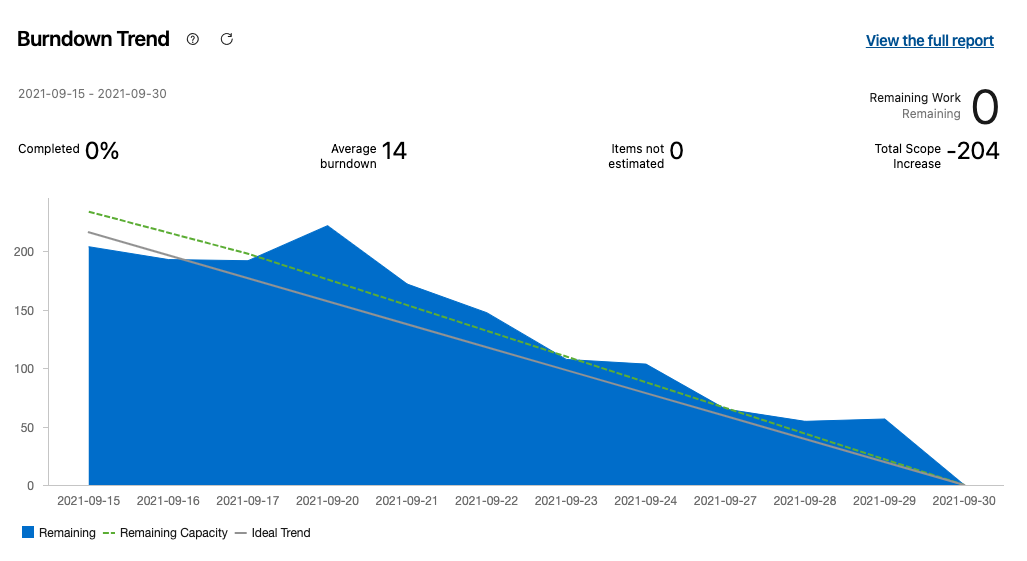
Ideal chart
In this chart we see the ideal situation where the team has estimated capacity correctly, did not over-commit, and managed to complete all assigned work and stories for this sprint on time. No adjustments are needed in this case.
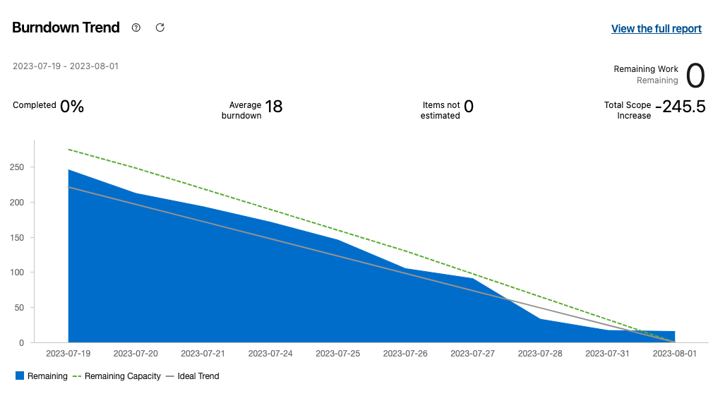
Not Perfect, but Still a Good Chart
In this chart we see a situation where the team started well but eventually fell slightly behind schedule. However, in the end they managed to complete the work on time. In this case, during the retrospective the team should discuss and come up with solutions to better match the ideal chart scenario.
“Something is Not Quite Right” Chart
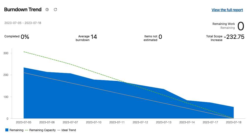
This chart shows that the team started well and within schedule, but halfway through they started being left behind and eventually did not completed the work on schedule. Remaining open stories had to be moved to the next sprint to be completed, so this may eventually hurt the project budget and timeline. During the retrospective the team needs to determine what caused this slowdown half way through the sprint and find ways to catch up in the following sprints.
“We’re Looking for Trouble” Chart
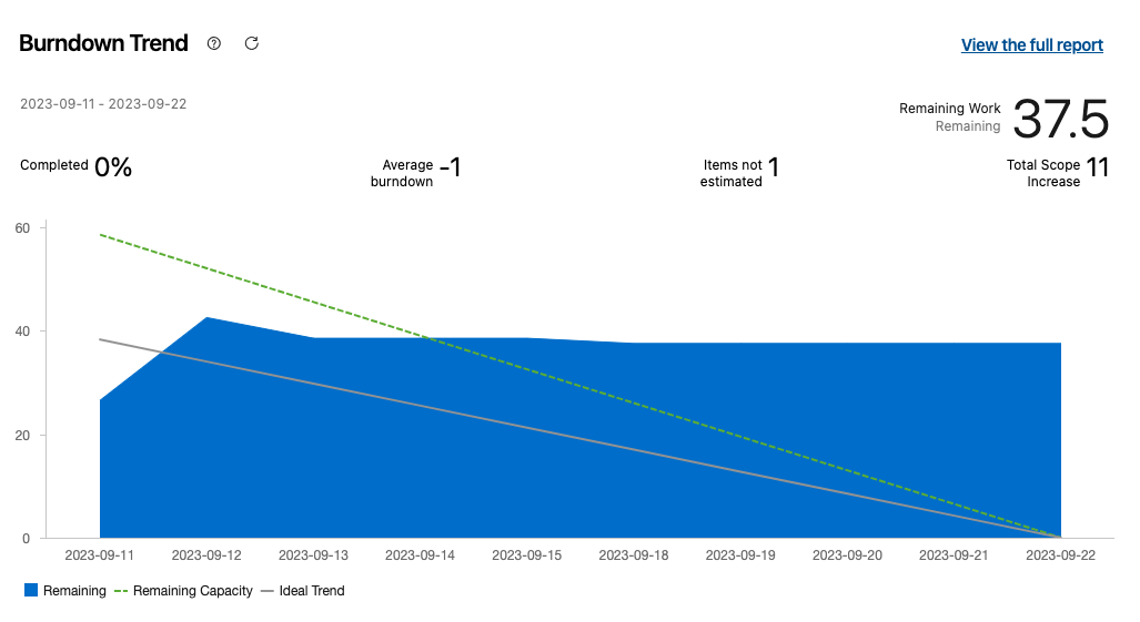
In this case, the team is probably doing some work but maybe they do not update their progress accordingly. Another reason might be that more work is being added during the sprint (in the form of bugs or new stories/tasks), therefore the “progress” line remains almost straight. During the retrospective the team should agree that progress is updated daily, and new tasks are not introduced halfway through the sprint and while the team doesn’t have the capacity to realistically handle these new tasks within the given timeframe.
Practical Applications
Utilizing the insights gathered from the burndown chart, project teams can take proactive measures to adjust and optimize their performance:
- Daily Stand-ups: Teams can leverage the burndown chart during daily stand-up meetings to discuss progress, identify obstacles, and prioritize tasks for the day.
- Mid-Sprint Adjustments: If the burndown chart indicates a deviation from the ideal trend line, teams can collaborate to identify root causes and adjust their approach accordingly. This may involve reprioritizing tasks, reallocating resources, or seeking additional support.
- Continuous Improvement: By analyzing past sprint burndown charts, teams can identify patterns, bottlenecks, and areas for improvement. This facilitates continuous learning and refinement of Agile practices.
The burndown chart can serve as a valuable tool for Agile teams, offering real-time visibility into sprint progress and facilitating data-driven decision-making. By understanding and leveraging the insights provided by the burndown chart, project managers and agile teams can enhance their efficiency, collaboration, and ultimately, their project outcomes.

Meet Evan Kordakis
Project Manager
⚽️✈️😀
Evan is a Project Manager and a digital delivery professional with a strong background in the business, technical, and financial industries. He has an MBA focused on digital strategies and has managed several successful projects for many of the biggest brands in Alberta. Outside of work, Evan enjoys travelling and watching, playing, and coaching soccer.