What Am I Going to Learn?
This guide will teach you how to create a fully customizable React Container inside Sitecore using Placeholders. This will provide you with an easy way to organize your renderings into sections within the Sitecore Experience Editor. You'll learn how to efficiently restrict which components your authors can use inside each container, enabling you to create custom containers for specific components.
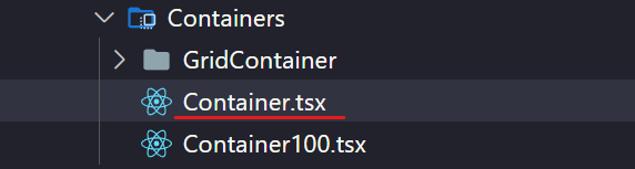
1. Next.js: Create Container.tsx
First, we need to create a new .tsx file that we will use for our Placeholder. This container file will
be where you make your container wide style changes. I'm going to name mine Container.tsx to keep it
simple, but other common container styles are Grid and Full/Half width containers.
Inside our new .tsx file, we want to add our container <div> which will hold whatever
styles you want your container to have. You can leave the div empty (like I am in this example), or you can
configure it to use CSS Grid or Flex-Box.
*Note: I've also added a data-component="container" to my div. This can be used to
more
easily debug when looking at an issue in production, allowing you to quickly differentiate between components.*
import React from 'react';
    import { ComponentParams, ComponentRendering } from '@sitecore-jss/sitecore-jss-nextjs';

    const Container = (props: ContainerProps) => {
      return (
        <div data-component="container" className=''>

        </div>
      );
    };

    //Types
    type ContainerProps = {
      rendering: ComponentRendering & { params: ComponentParams };
      params: ComponentParams;
    };
2. Sitecore: Create a New Rendering
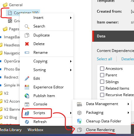
The next step requires us to create a new Rendering Item for our container in Sitecore. To do this, we want to find an existing Rendering Item, right click → Scripts → Clone Rendering. You can clone any rendering and turn it into a container.
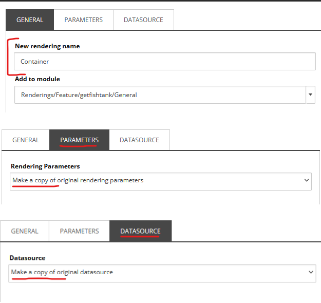
Next, we want to update the information for our new rendering. Under the “General” tab, we only need to update the name. Under “Parameters” and “Datasource” it's important to select “Make a Copy”.
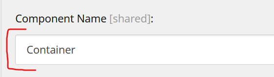
Don't forget to update the Component Name on your new rendering to match your .tsx file.
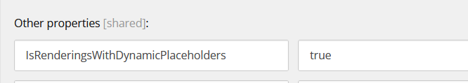
After updating your Component Name, scroll down to Other Properties and make sure that there is a value of
IsRenderingsWithDynamicPlaceholders set to true.
To keep all your new containers organized, and to make it accessible inside the Sitecore Experience Editor, we can
create a new Category under “Available Renderings” named Containers. We can use this for
all
our future container types.
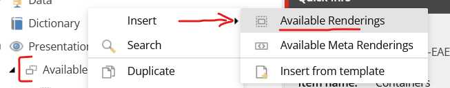
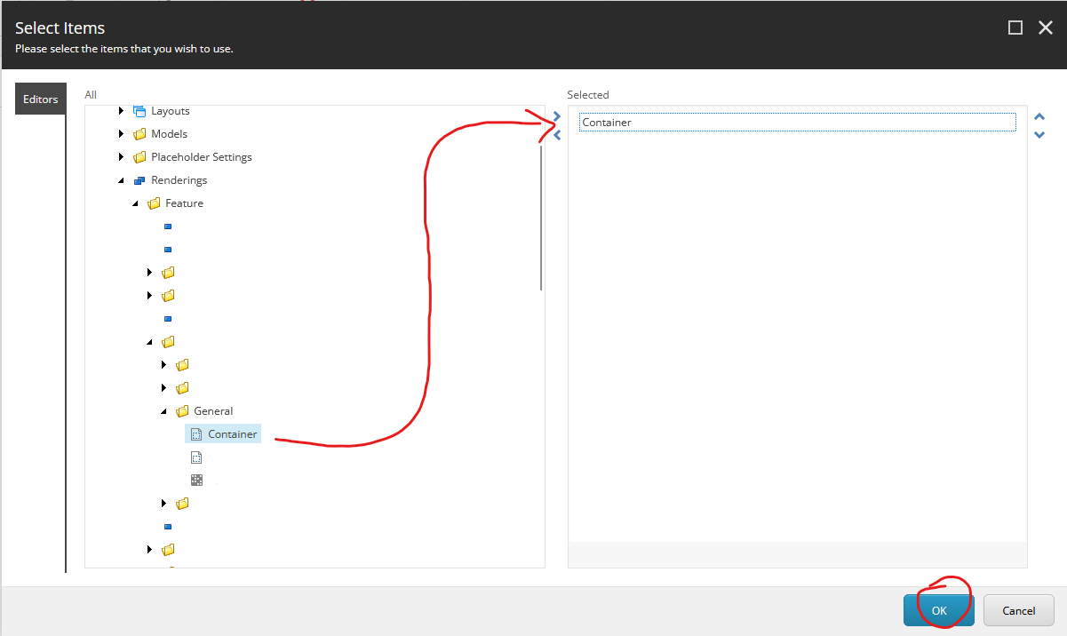
After adding our new “Available Renderings”, we can click “edit” and add our new
Container rendering by double-clicking on it.
3. Sitecore: Create a New Placeholder
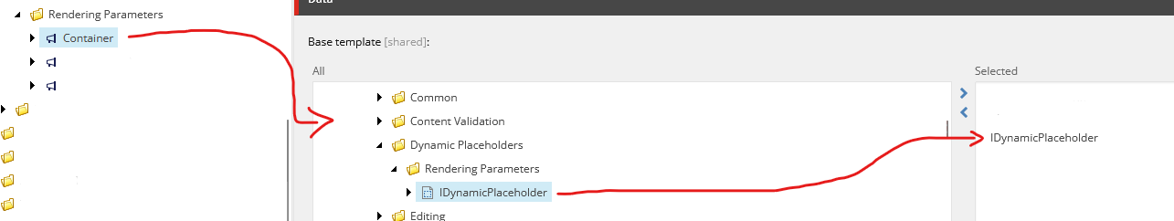
Next, we want to configure our new rendering to work as a placeholder. First, you want to find your new item’s
“Rendering Parameters”, and add
IDynamicPlaceholderto the "Base Template". You will be able to find the “Rendering
Parameters” under/sitecore/templates.
You can find IDynamicPlaceholder under Foundation/Experience Accelerator/Dynamic
Placeholders/Rendering Parameters.
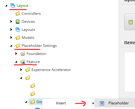
Scroll back up and open “Layout”. You want to open up the “Placeholder Settings” folder and
insert a new placeholder under “Feature”. Give the new placeholder the same name as your Container
Rendering. Path: Layout/Placeholder Settings/Feature
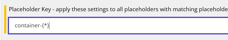
The important part, is to ensure you update the “Placeholder Key”. This is what we will use in our
.tsx file to help Sitecore link our component to our placeholder. Enter the name of your rendering
followed by -{*}.
Note: Every placeholder you make should have a unique placeholder key.
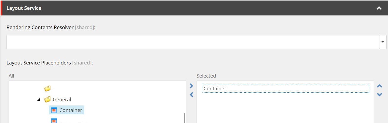
Finally, return to your original rendering item that we created in step 2. Scroll down to the “Layout Service” sections and find the placeholder you just created.
4. Next.js: Link Sitecore Placeholder to Container.tsx
Add the placeholder details to the container .tsx
Next, we want to import the <Placeholder/> component from sitecore-jss-nextjs, and
create a placeholder key that matches our Placeholder configuration in Sitecore. We can then pass down our key
value,
and the props rendering value, directly into the <Placeholder/> container.
import {ComponentParams, ComponentRendering, Placeholder } from '@sitecore-jss/sitecore-jss-nextjs';

    const Container = (props: ContainerProps) => {
      const phKey = `container-${props.params?.DynamicPlaceholderId}`;

      return (
        <div data-component="container" className="">
          <Placeholder name={phKey} rendering={props.rendering} />
        </div>
      );
    };
5. Sitecore: Restricting Which Components Can Be Used Inside Your Placeholder (Optional)
There is a chance that you want to restrict the renderings that your authors can place inside a container. By
default, Sitecore allows all renderings to be used within your placeholder; however, it's extremely simple to
restrict
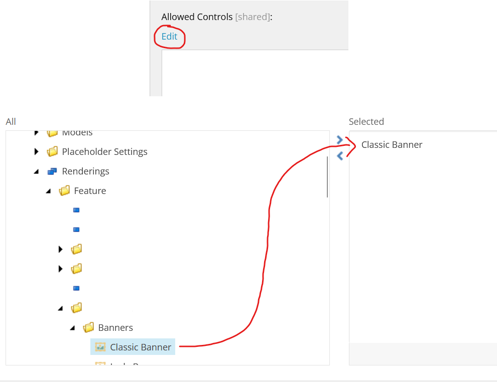
the accepted renderings. Simply return to the placeholder that we created in step 4 under
Layout/Placeholder Settings/Feature and scroll down to the “Allowed Controls” section. Once
opened, you are able to selectively choose which renderings you want to allow inside your new placeholder.
Now You’re a Container Master!
Now, you know how to create custom Next.js containers by utilizing Sitecore Placeholders. Containers can be extremely versatile and used in a large variety of ways. A common approach is creating a Bento Box-style Grid container, enabling your authors to construct a custom grid layout on any page!

Meet Tyler Holmes
Full Stack Developer
🇬🇧🧑💻🏸
Tyler is an experienced Full Stack Developer who has worked on a plethora of unique projects. He possesses a deep understanding of Technical SEO, C#, and React/Next.js.