Introduction
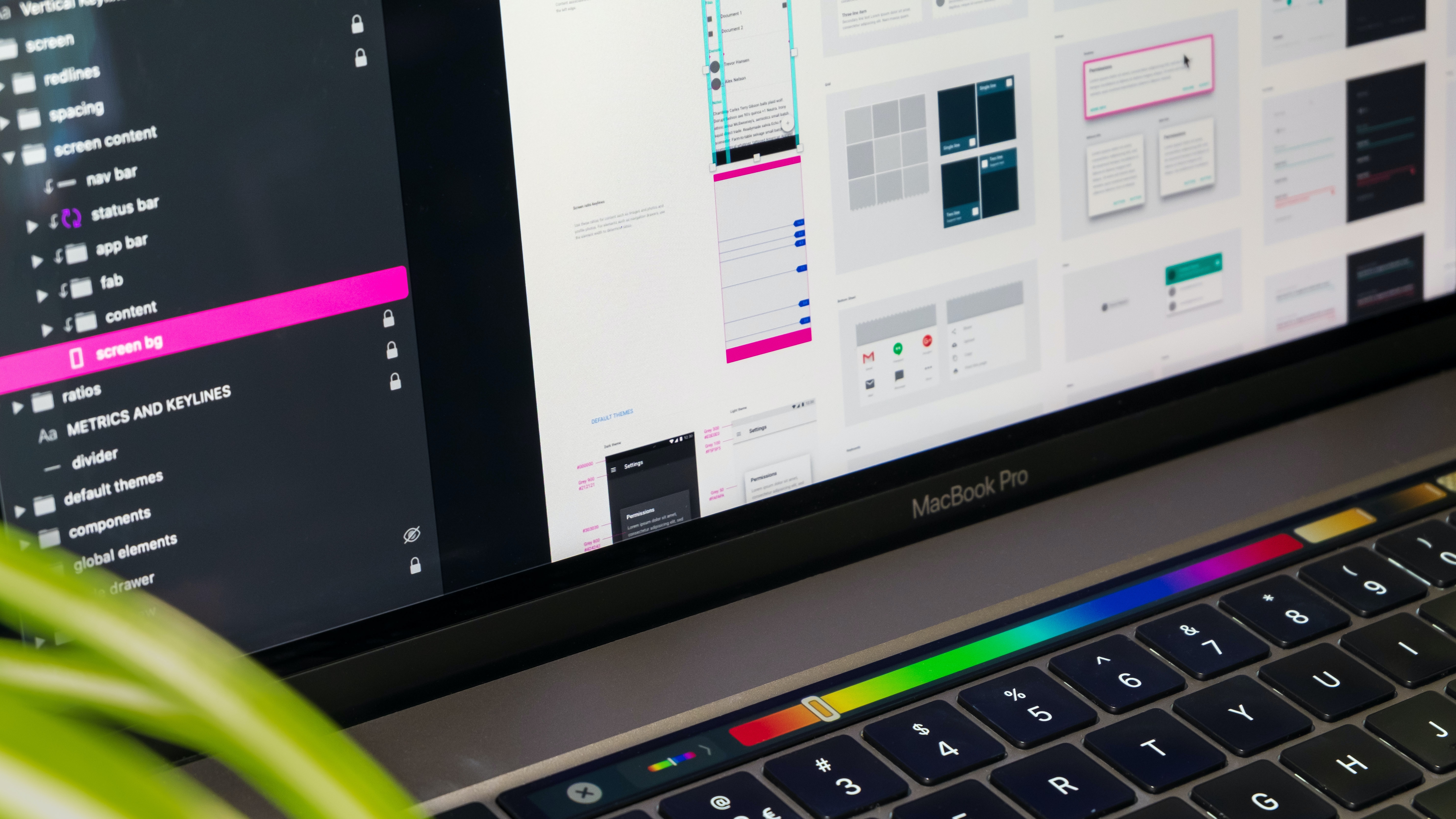
Do you need to convert your client interface from alright to extraordinary?
In this quick little tutorial, we're going to look at 5 golden rules for creating beautiful user interfaces. Each hack will instantly improve the aesthetics of your user interface while also improving accessibility and usability. Are you ready?
1. The 60-30-10 Colour Rule

Common in interior design spaces but not limited to UI designers, the 60-30-10 rule helps create a balanced colour palette, and you can use it to enhance the look and feel of the UI.
As a rule, your palette should include:
- A Primary colour (60%)
- A Secondary colour (30%)
- An Accent colour (10%)
60% of your UI design should have a dominant colour, 30% a secondary colour, and 10% an accent colour. This will result in a cleaner, more balanced and more beautiful interface.
2. Harness the Power of Contrast

Contrast is a key UI design. It helps the user distinguish between distinct elements and is necessary for ensuring that text is readable. As a result, it has a significant influence on usability and accessibility.
Use plenty of contrast if you want to build outstanding, beautiful UI; here are the best ones:
- Use it between images and text. To boost the contrast between photos and text, apply a basic overlay.
- Use it between the text and the background. Make the text darker when placed on a bright backdrop, for example.
- Use it between different sections and elements on the page. Colour contrast and whitespace can emphasize where one section or element finishes and another begins.
To achieve the best contrast, use dark and light colours, contrast colour temperatures (for example, combining warm colours such as red, orange, and yellow with cool colours such as blue, green, and purple), and contrast textures (for example, placing a textured image on top of a 'smooth' background). You will eventually discover the optimal combination for contrast.
3. Oh, the Shadows

Subtle shadows are the key and may be used to add depth to your designs. However, there is a common error that designers need to correct when employing shadows that might detract from an otherwise lovely interface.
Can you figure out what type of mistake it is? It is inconsistency in the location of the light source. Basically, where the light originates from.
Consider where the light is coming from while casting shadows, and keep in mind that it should only come from one source, which is generally above the item being shadowed.
So, instead of having some components with shadows generated at the bottom (as if the light source is above them) and some elements with shadows formed to the left (as if the light source is to the right), construct your shadows uniformly based on one light source position.
Shadows are little but important features that ought to be noticed. Small nuances are always important.
4. Whitespace is Your Friend, Not Your Enemy
You are probably already aware of whitespace and its significance. The 'empty' area surrounding various components on the page and between sections is also called negative space.
Whitespace has an influence on both usability and aesthetics. It separates the various UI components, minimizing visual clutter and facilitating the user's ability to scan and comprehend the material in front of them.
Am I utilizing enough whitespace? is a straightforward yet incredibly powerful question to ask yourself if you want to enhance your UI designs significantly. Does each page/screen have adequate space for the elements to breathe?
More whitespace can immediately clean your designs and provide a more professional look. Increase your whitespace gradually until you get the ideal ratio.
5. Principles of Text Alignment

Text alignment is another UI design trick that is really effective.
While you might be tempted to adopt centre alignment because you believe it provides your designs more symmetry, doing so could compromise the readability and accessibility of your website.
Follow these recommendations for text alignment to elevate your user interface:
- Left is king for longer text. Left alignment is preferred for content that is more than one or two sentences long. This influences how we ordinarily consume literature.
- Limit center alignment to headlines. As a general rule, save centre alignment for headlines and extremely brief text fragments.
- Right alignment is only used for special cases. Use right alignment for website navigation and for presenting numbers or data in a table.
Check your designs to make sure you are using correct text alignment, and make the necessary adjustments. Keep in mind: Left is king.
Takeaway
Your UI designs may be improved by making a few minor, straightforward changes, which can elevate them from plain to lovely while increasing their usefulness and accessibility. That is the essence of excellent UI design!
👋 Hey Sitecore Enthusiasts!
Sign up to our bi-weekly newsletter for a bite-sized curation of valuable insight from the Sitecore community.
What’s in it for you?
- Stay up-to-date with the latest Sitecore news
- New to Sitecore? Learn tips and tricks to help you navigate this powerful tool
- Sitecore pro? Expand your skill set and discover troubleshooting tips
- Browse open careers and opportunities
- Get a chance to be featured in upcoming editions
- Learn our secret handshake
- And more!


Meet Karol Buratynski
UX Designer
⛰👨💻⚽️
Karol, aka 'K', is a UX Designer with a wealth of knowledge and experience in everything UX related. His focus and passion are to always understand, communicate, and execute on user behaviour through both quantitative + qualitative research and analysis. K aims to bring the design and minimalism process closely together, focusing on creating experiences for the user while taking business and brand needs into consideration from the start. His goal is to always test, learn, and design quality results efficiently. He likes to travel and discover new places with his family.