Life Before CSS Grid
CSS Grid let's websites present information in new and novel ways that until just a few years ago, was never imaginable.
Before CSS Grid, websites had to keep their ideas for how to present information modest. There were limits to the technology. In the late 90’s, creating layouts required developers to know a handful of hacks that took things that weren’t meant for layout and turned them into layout tools.
Despite the inventiveness of these techniques, the people behind web standards understood that there needed to be a way for developers to realize their visions for layout without resorting to hacks. In 2009, technology was changing and users were using a multitude of devices that forced web standards to evolve. One evolution was CSS Flex.
CSS Flex
CSS Flex was a huge shift forward for web layouts. Alignment and ordering of elements was easy. Elements responded to different screen sizes in a way that was impossible before CSS Flex. However, there were still some limits to CSS Flex that forced design compromises and workarounds to evolve alongside the CSS standard.
In 2021, as I write this, the idea that layout grids could be anything but evenly spaced columns (usually 12) that run down the length of a screen still seems counterintuitive to how a lot of websites are created. One obstacle that CSS Grid overcomes, is the difficulty in creating asymmetrical grids.
CSS Grid
Most websites use a symmetrical 12-column grid structure borne out of the constraints of CSS Flex. However, CSS Grid lets developers create a variety of grids easily. For example, an asymmetrical grid with a single column that takes up 50% of the space on the left side of a screen, with the other 50% of the screen divided into 2-columns on the top and 5-columns on the bottom would be simple to create.
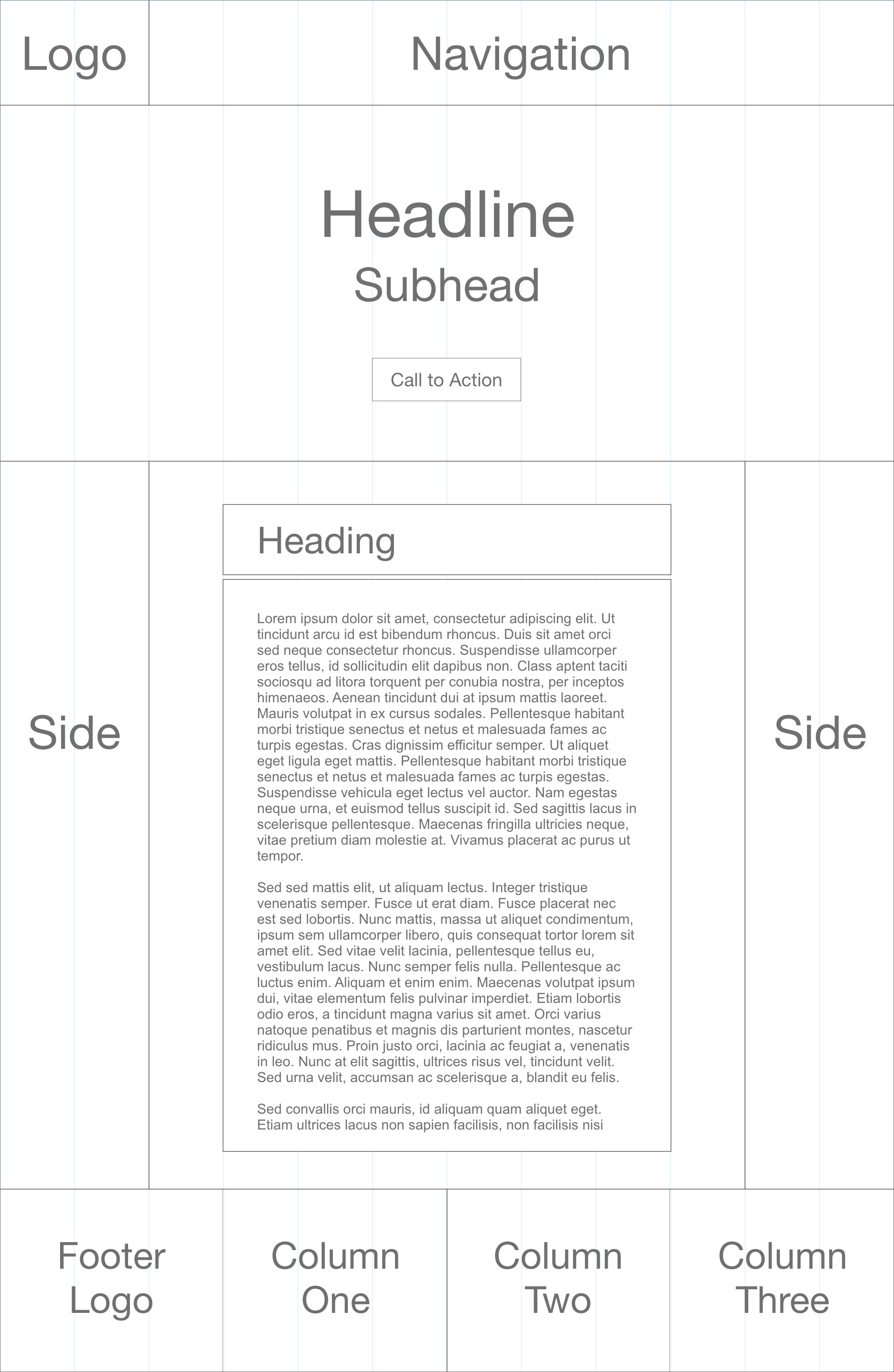
Before CSS Grid
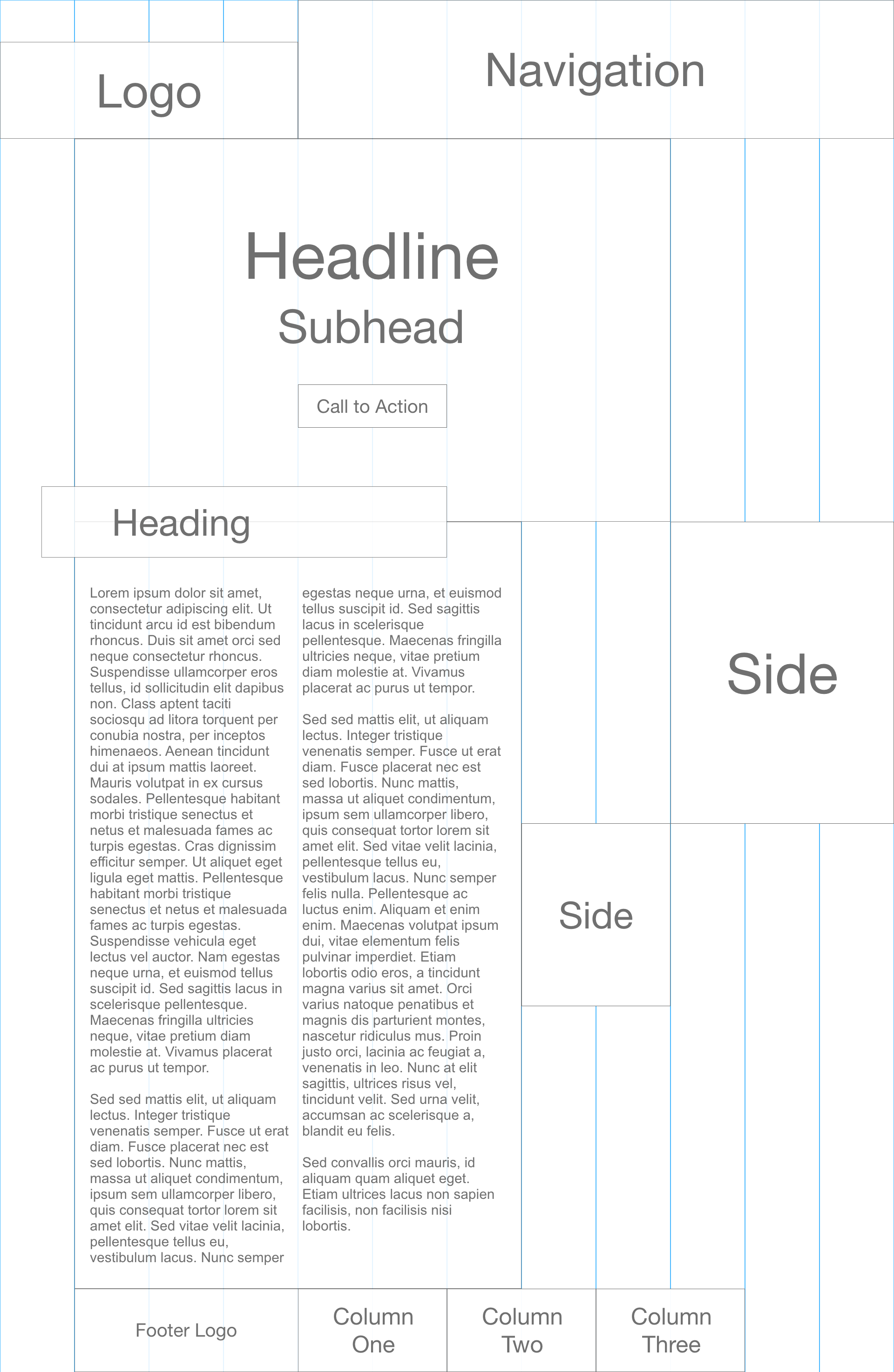
After CSS Grid
The impact of this is that more and more websites will start to look distinct and dynamic as opposed to looking similar and static. Put another way, we're going from paintings on cave walls to painting the walls of the Sistine Chapel.
👋 Hey Sitecore Enthusiasts!
Sign up to our bi-weekly newsletter for a bite-sized curation of valuable insight from the Sitecore community.
What’s in it for you?
- Stay up-to-date with the latest Sitecore news
- New to Sitecore? Learn tips and tricks to help you navigate this powerful tool
- Sitecore pro? Expand your skill set and discover troubleshooting tips
- Browse open careers and opportunities
- Get a chance to be featured in upcoming editions
- Learn our secret handshake
- And more!
